Plot style gallery
Renders of the same example figure under each registered style
(mmml.utils.plotting.styles), so a look can be picked by eye instead of
from a description. Regenerate with python scripts/render_plot_style_gallery.py.
Every example also demonstrates the legend-outside-the-plot rule (see
docs/plotting-style-guide.md "Legends live outside the plot") via
legend_outside(ax) — never overlapping the data, and free to grow long
(reads like a small table of series → color/marker) without crowding
anything.
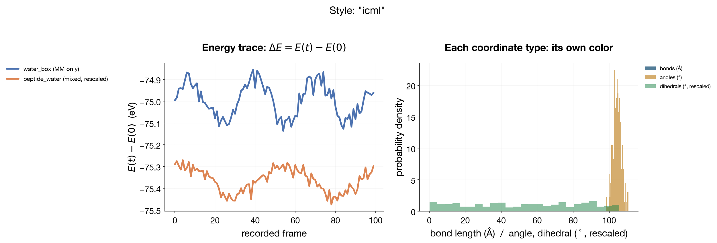
Current pick: "icml" — clean sans-serif, muted "seaborn deep"-style
categorical colors, moderate (not oversized) type; the closest preset to a
modern ML-conference figure. This is what workflows/*/scripts/plot_results.py
and plot_structure.py use by default now.
Defaults at a glance
Before picking a style by scrolling through full example figures below, here
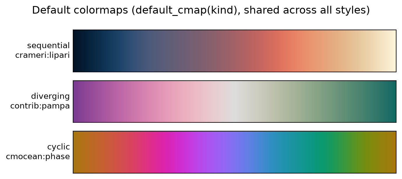
is every preset's default categorical color cycle, plus the three house
colormap defaults (which are shared across all styles — colormaps are
chosen by what the data is, sequential/diverging/cyclic, not by which font
preset is active). Regenerate with python scripts/render_style_defaults_gallery.py.
Categorical color cycle per style
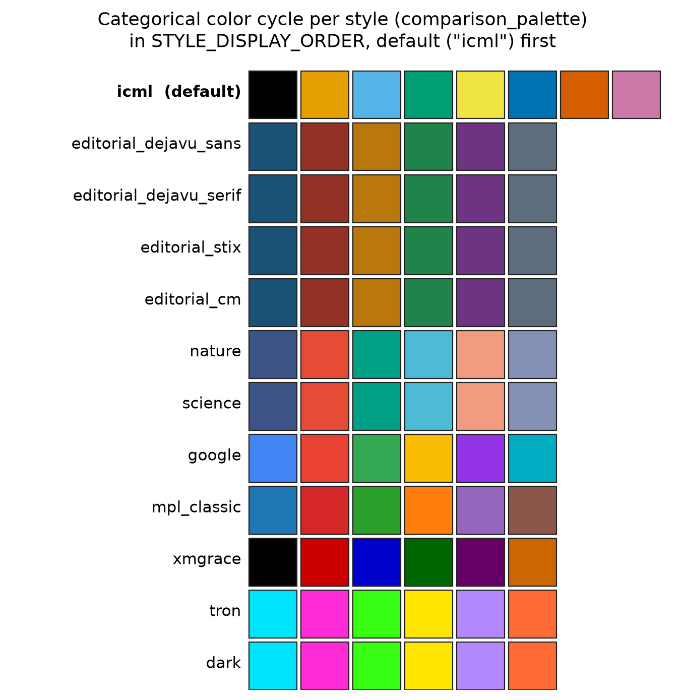
icml's categorical cycle (and so the house default for every plot that
doesn't override it) is the Okabe–Ito
eight-color palette — designed by Masataka Okabe and Kei Ito specifically to
stay distinguishable under protanopia, deuteranopia, and tritanopia. It
isn't an opt-in variant: series identity stays legible for colorblind
readers by default, not only when a special preset is chosen.
("icml_okabe_ito" still resolves as an alias to "icml" for anything
written before the two merged.)
Default colormaps (default_cmap(kind))
Non-color categorical cycles: line styles and markers
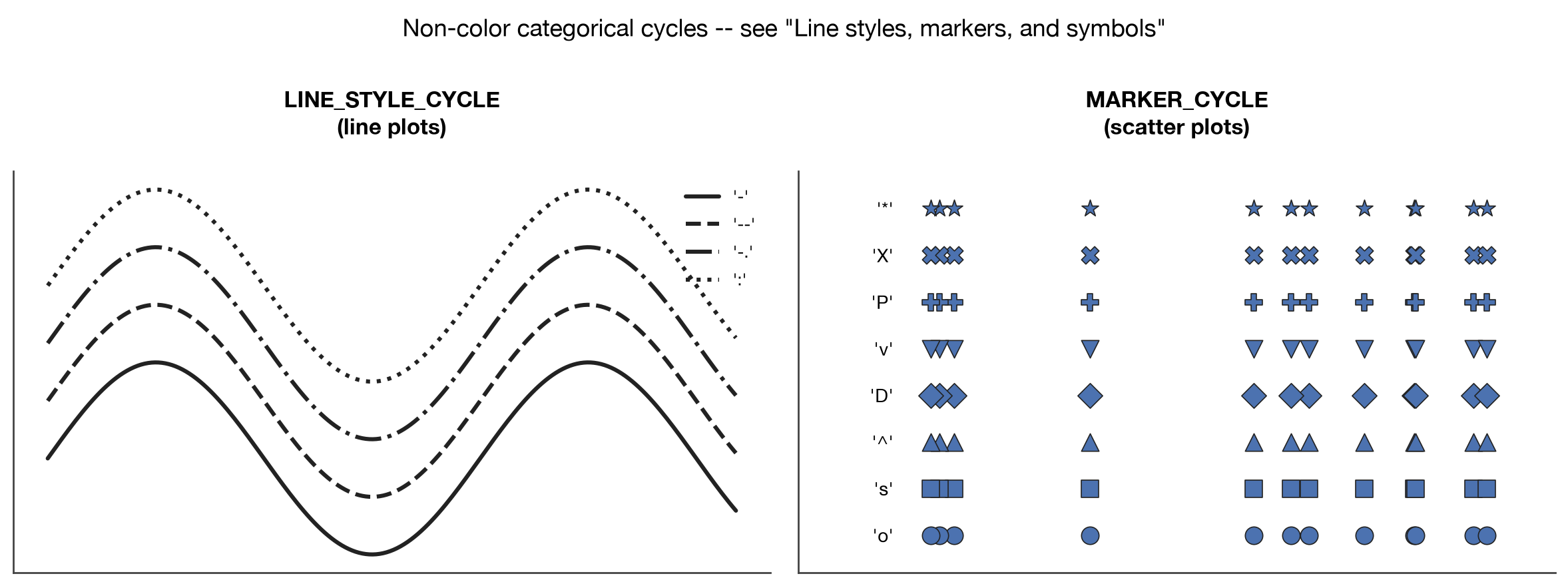
Color isn't the only default cycle — LINE_STYLE_CYCLE and MARKER_CYCLE
are shown here on the graph type each actually applies to (line styles on a
line plot, markers on a scatter), not as an abstract legend key, so what
you'll actually see in a figure is what's pictured:
Semantic status palette
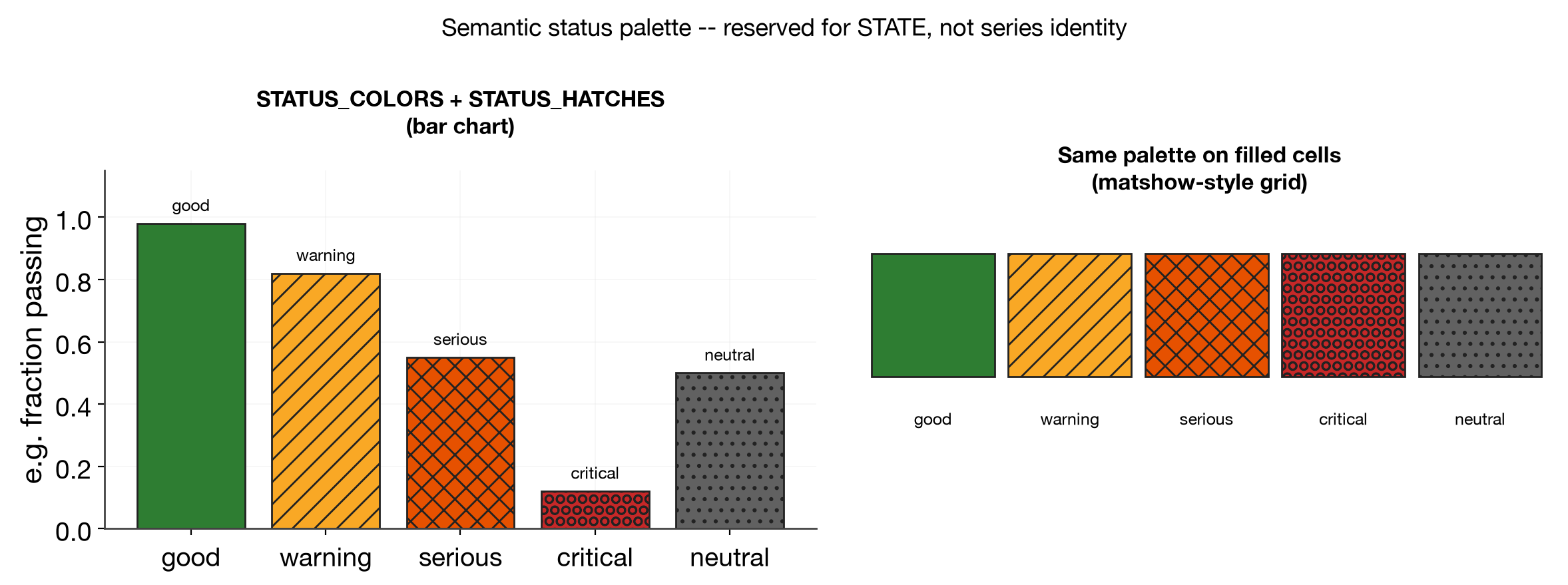
A separate, reserved palette for encoding state (pass/fail,
converged/diverged, in/out of tolerance) — never reused for "the next
series in a categorical plot." Four levels (good/warning/serious/
critical), plus neutral for a non-judgmental baseline, each paired with a
hatch texture so state doesn't rely on color alone (print-safe,
colorblind-safe redundancy — same principle as line styles/markers for
categorical identity):
from mmml.utils.plotting.styles import status_color, status_hatch

ax.bar(labels, values, color=[status_color(s) for s in states],
       hatch=[status_hatch(s) for s in states], edgecolor="#222222")
status_color("success")/status_color("fail") are convenience aliases for
"good"/"critical" — same fixed colors, just the common pass/fail
spelling for a binary check (e.g. one FD test that's just PASS or FAIL, no
borderline state).
icml
The editorial_* family (large-type/thick-line/no-spine variants)
These four share the same axes/spacing treatment — large type, thick
lines, no top/right spine, faint grid — only the font differs. Kept in the
gallery as an alternative "read from across the room" look for a different
kind of figure (e.g. a talk slide) than "icml"'s conference-paper density.
Note on naming: these were previously grouped under one preset literally
called "tufte". That was a category error — Tufte described principles
(data-ink ratio, redundant encoding, small multiples), not a single font or
palette, so no one preset should claim his name. The axis/spacing choices
below (no chart junk, minimal spines) draw on those principles; the presets
are named editorial_* instead. "tufte" still resolves as a backward-compat
alias to editorial_stix, but new code should name the variant directly.
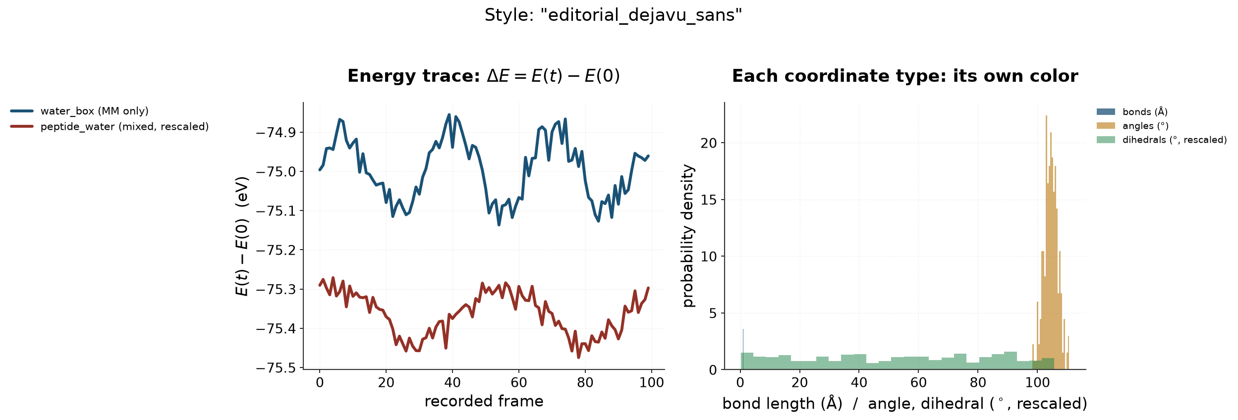
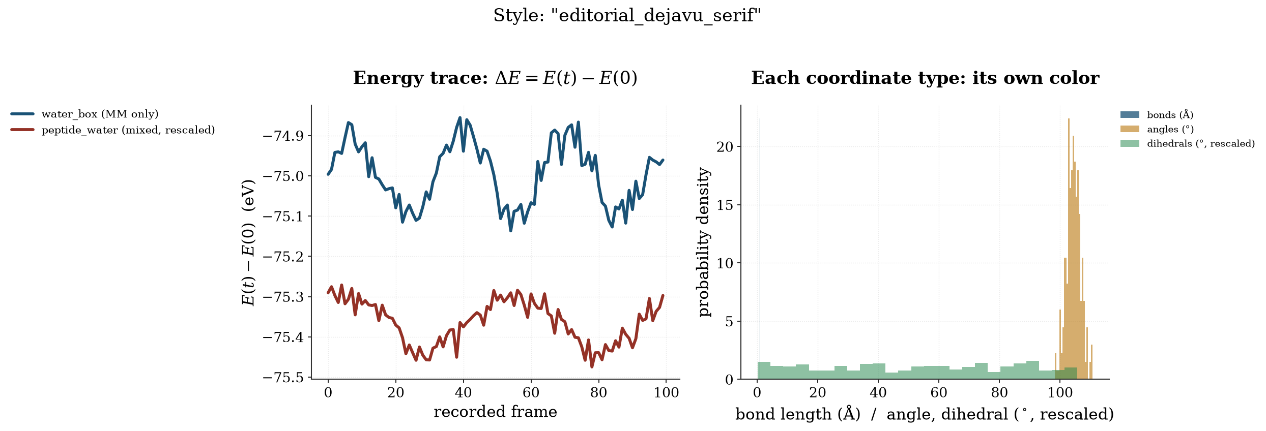
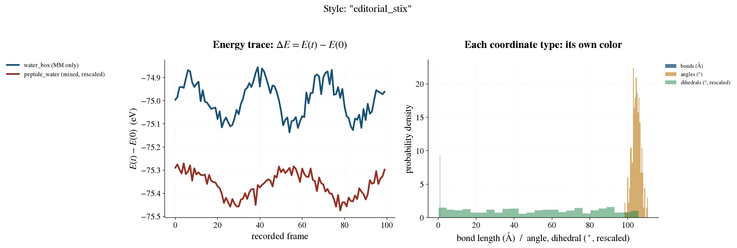
Each example also demonstrates the "semantic color, not palette index"
principle from docs/plotting-style-guide.md:
the two energy traces are colored by system (not palette order), and the
right-hand panel gives bonds/angles/dihedrals three different colors
because they're three different physical quantities — not the same blue
reused three times (the bug this pass fixed in
scripts/plot_trajectory_structure.py::plot_internal).
editorial_dejavu_sans
Matplotlib's bundled sans-serif (DejaVu Sans) — renders identically on every machine, no font-substitution risk.
editorial_dejavu_serif
Matplotlib's bundled serif (DejaVu Serif) — same reliability guarantee as above, traditional serif feel.
editorial_stix
STIX serif — a journal-typeset look (closest to what most physics/chemistry
papers use). This was the previous "tufte" preset.
editorial_cm
DejaVu Serif body text with Computer-Modern-style math
(mathtext.fontset="cm") — the classic LaTeX-paper look for equations
specifically, while regular text stays DejaVu.
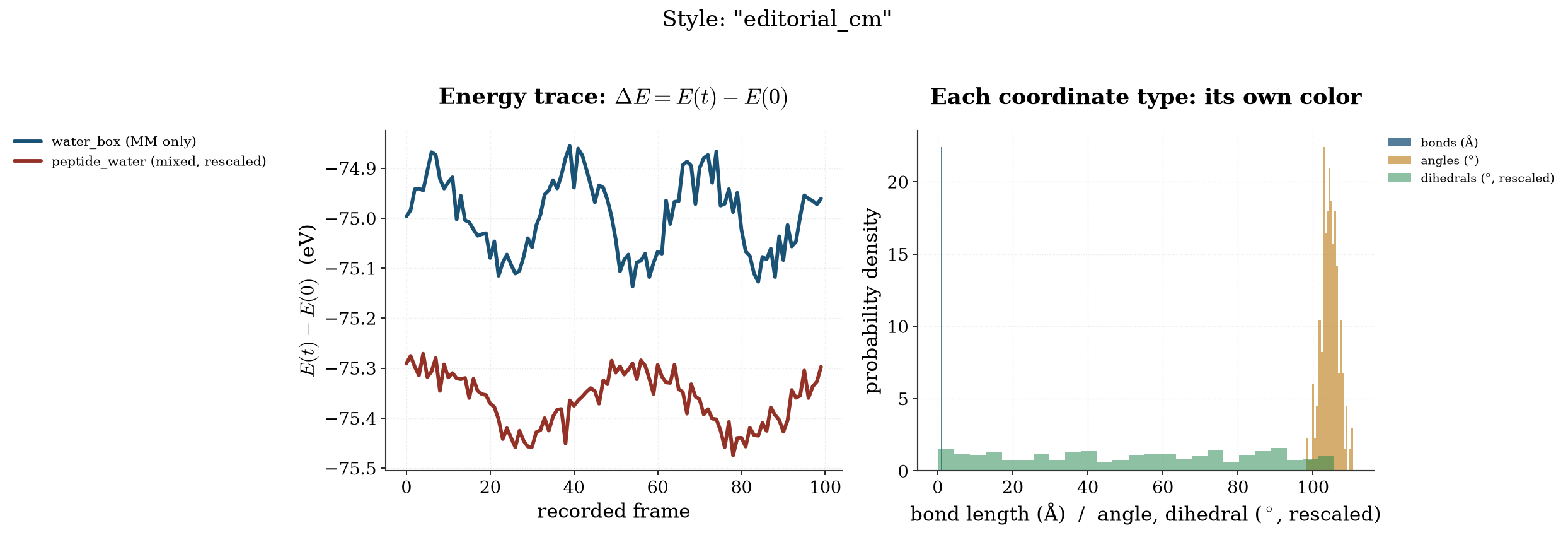
Chart types (not just fonts)
Same style ("icml"), different chart forms — regenerate with
python scripts/render_chart_type_gallery.py. Each one names the specific
Tufte principle it demonstrates, since "in line with Tufte's teachings" is
about more than axis minimalism — several of his central ideas (small
multiples, the range-frame, data-ink ratio, redundant encoding) are concrete,
nameable techniques, not just "make it clean." Use these to judge whether a
form, not just a font, fits before committing to it for a real figure.
Radial (polar)
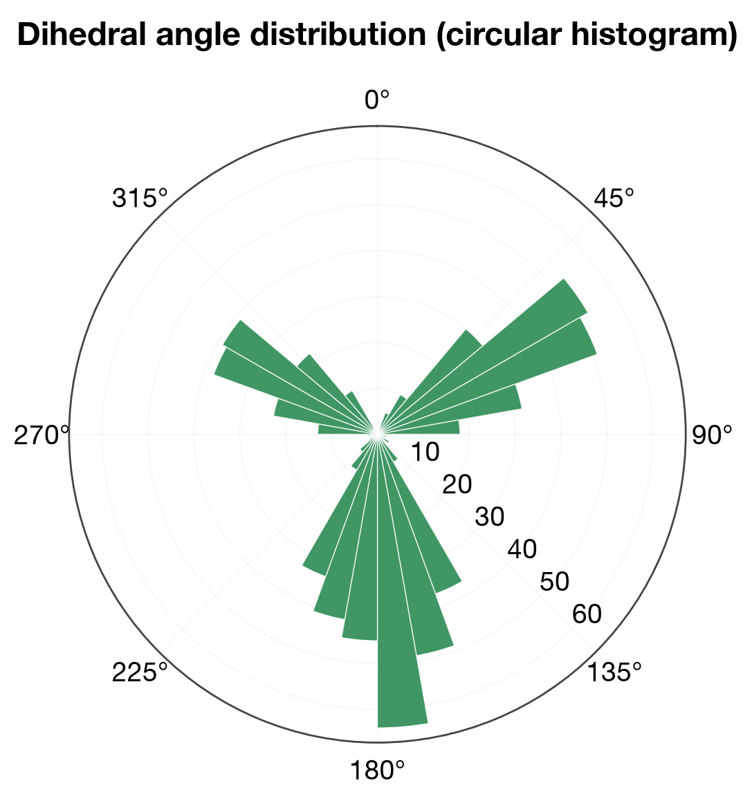
A circular histogram of a periodic quantity (dihedral angle). Use the geometry the data actually has — an angle wraps around; forcing it onto a linear 0-360° axis hides the wraparound at the boundary.
3D surface
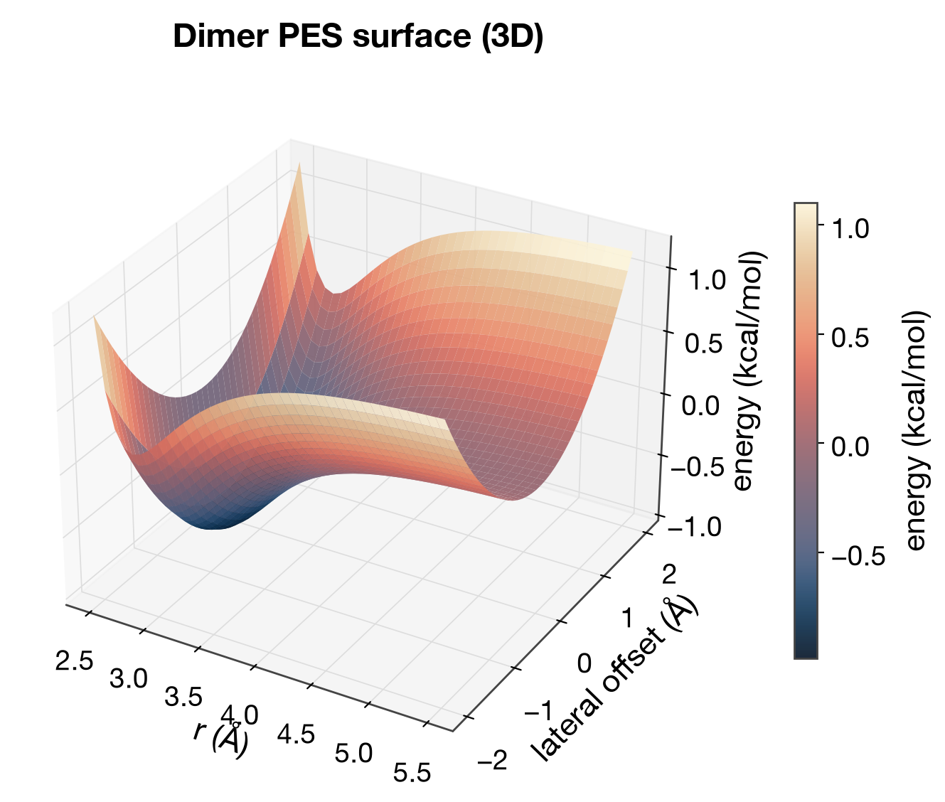
A dimer PES as an explicit 3D surface. Included because it was asked for,
but flagged honestly: 3D is data-ink-expensive (occlusion, projection
distortion, no way to read exact values) — Tufte generally preferred 2D +
color/contour for exactly this reason. The matshow and range_frame
panels below are the better-Tufte alternative for two-variable-vs-response
data of this kind.
XY scatter with confidence interval
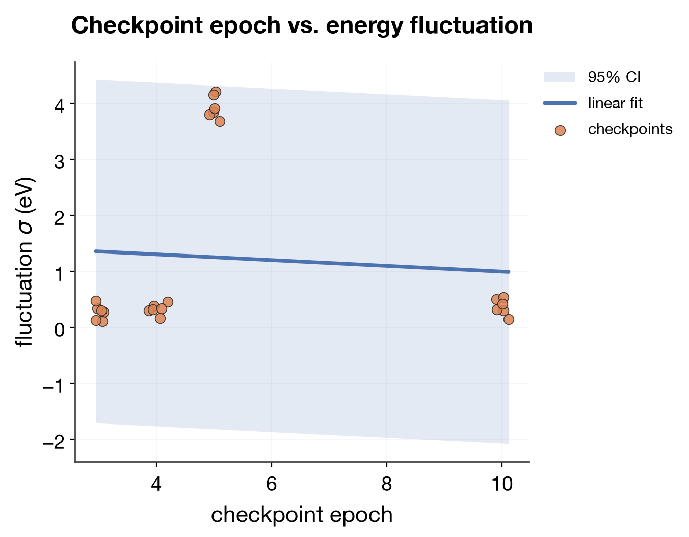
A fitted trend with a shaded 95% CI band, raw points still visible underneath. The band carries the uncertainty; no per-point error bars cluttering every marker.
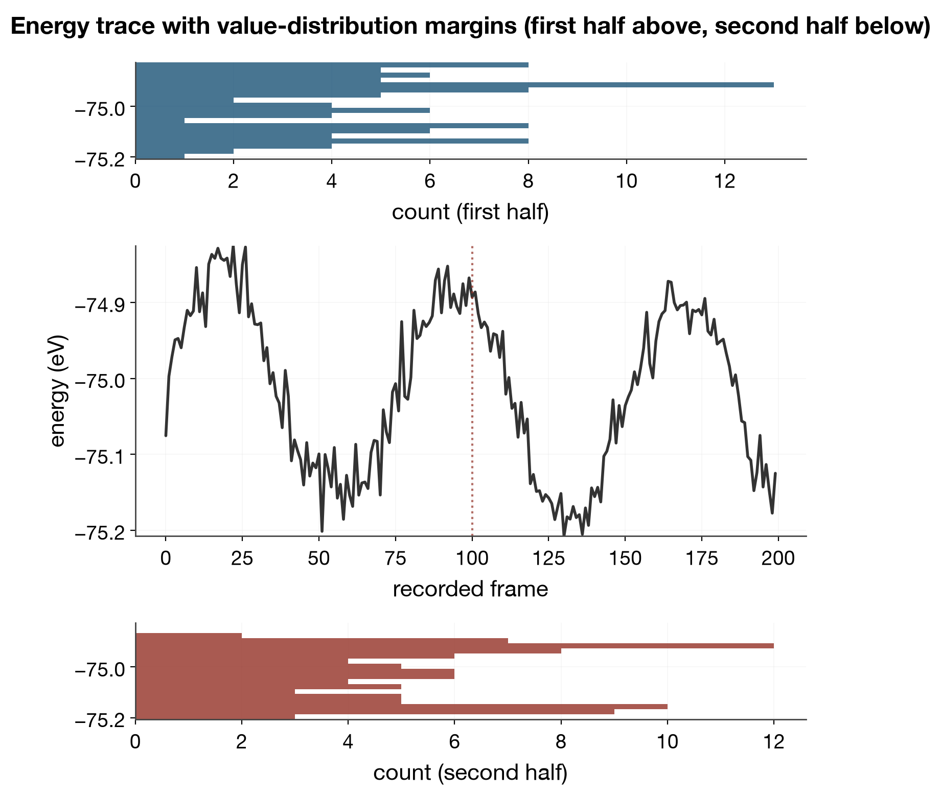
Time series with distributions above and below
Not seaborn's jointplot (marginals top+right, sharing the plot's
x-axis) — here the two extra panels sit above and below the middle one
and share its y-axis instead, showing how the value distribution itself
shifts between the first and second half of a run. Two related
distributions placed for direct visual comparison, Tufte's small-multiples
idea applied to margins instead of a legend/caption.
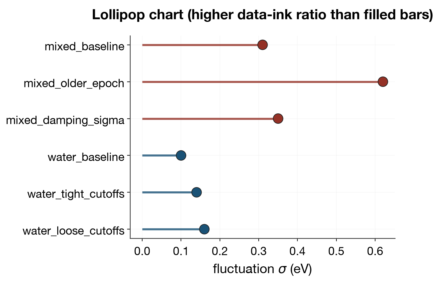
Lollipop chart
A thin stem + a dot instead of a filled bar — the most literal data-ink-ratio
win in this gallery: nearly all of a bar's ink minus the fill, for the same
information (position along the stem = value). See docs/plotting-style-guide.md
"Overlaid semi-transparent bars, not more panels" for the sibling rule about
when not to add another panel instead.
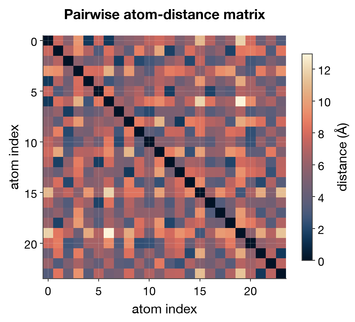
Matrix heatmap (matshow)
A pairwise atom-distance matrix. Color encodes magnitude directly on the (i, j) grid the data already has — no need to invent x/y positions for it the way a scatter would.
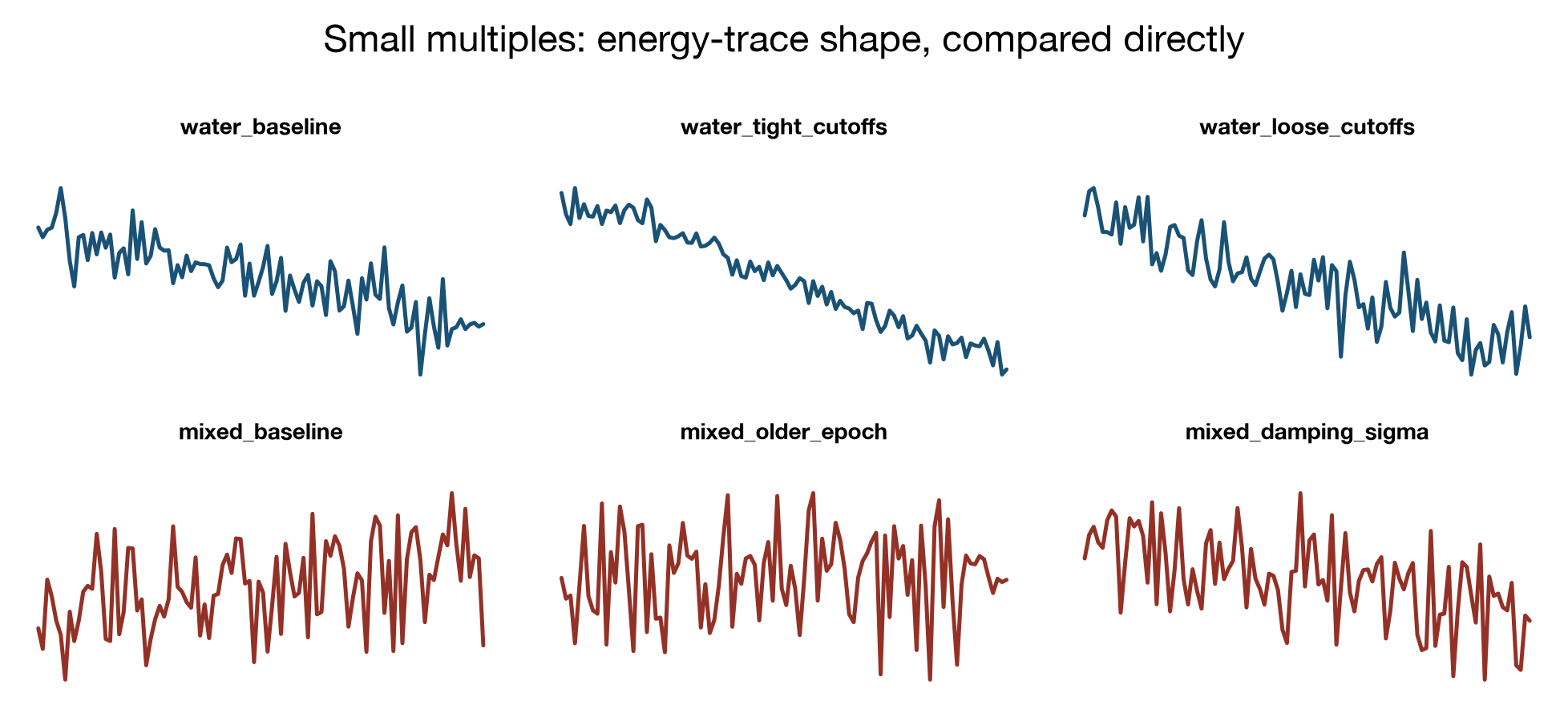
Small multiples
Tufte's signature form, by name: many small, identically-scaled panels, with
almost all chart furniture (ticks, boxes, axis labels) stripped since the
shape is the point, not reading an exact value off any one panel. Compare
directly to the “everything overlaid in one legend-heavy panel” approach
used in workflows/*/scripts/plot_results.py — small multiples is the
alternative worth considering when a sweep has few enough series to lay out
as a grid.
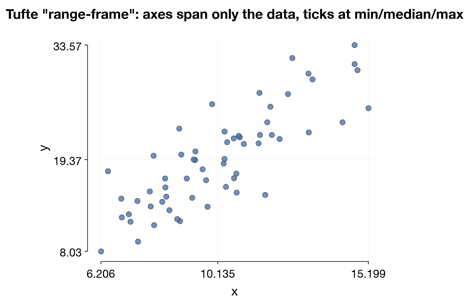
Range-frame
Tufte's own named contribution (The Visual Display of Quantitative Information): axis lines span only the data's actual range, not an arbitrary origin-anchored box, with ticks only at min/median/max. Worth calling out explicitly since it's a specific technique, not a generic "minimalist" choice.
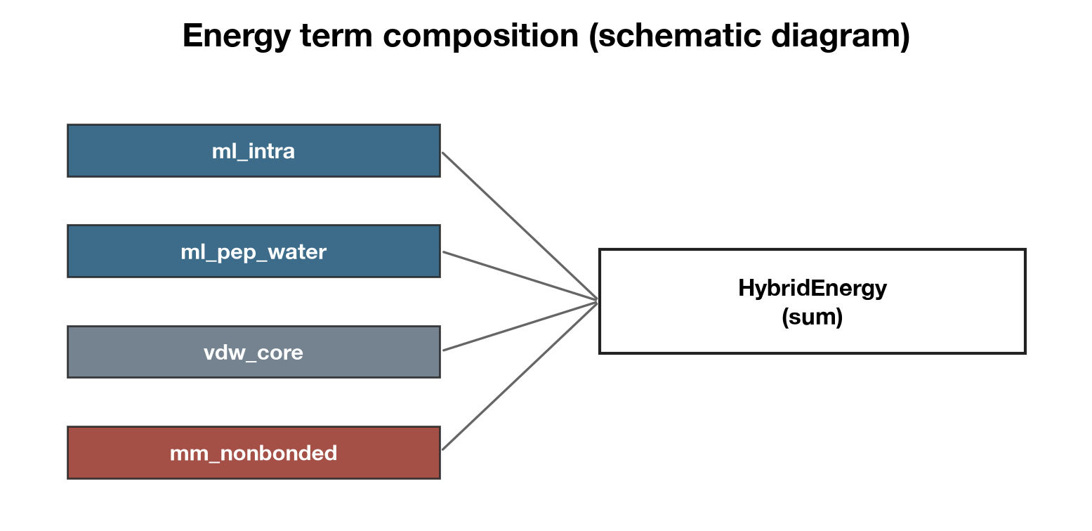
Schematic diagram
Not a data plot — boxes + thin connecting lines for composition/flow (here:
how HybridEnergy sums its terms). Same principle applies to diagrams as to
charts: no drop shadows/gradients/3D bevels, labels placed directly on the
elements they describe rather than pulled out into a legend.
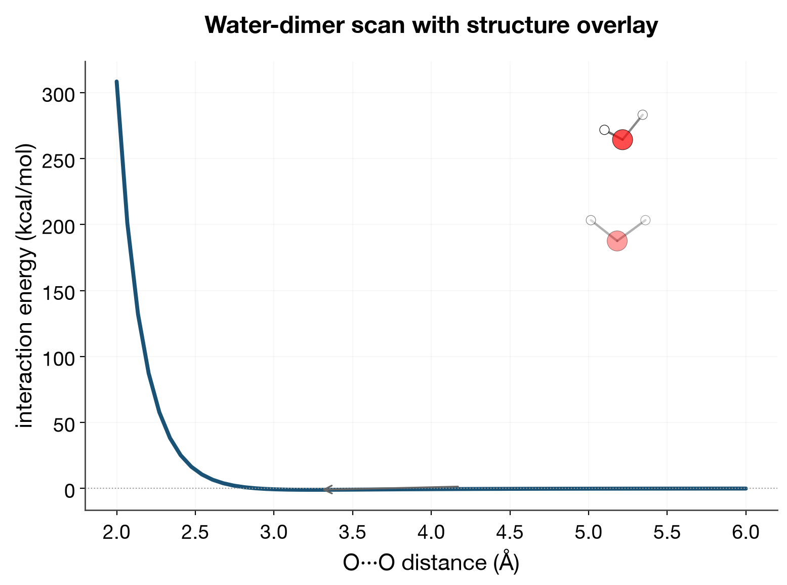
ASE Atoms as an overlay on a data plot
Not a separate figure next to the data — an ax.inset_axes() holding
scripts/plot_utils.py::render_dimer_atoms's
ball-and-stick render, placed directly over the point on the curve it
corresponds to. Tufte principle: put the explanation where the eye already
is, not somewhere the reader has to cross-reference by hand. This is the
"good ASE Atoms plot" precedent (jmol element colors, depth-cued alpha,
within-fragment-only bonds) applied as an overlay rather than its own panel
— see docs/plotting-style-guide.md "Rendering ASE Atoms".
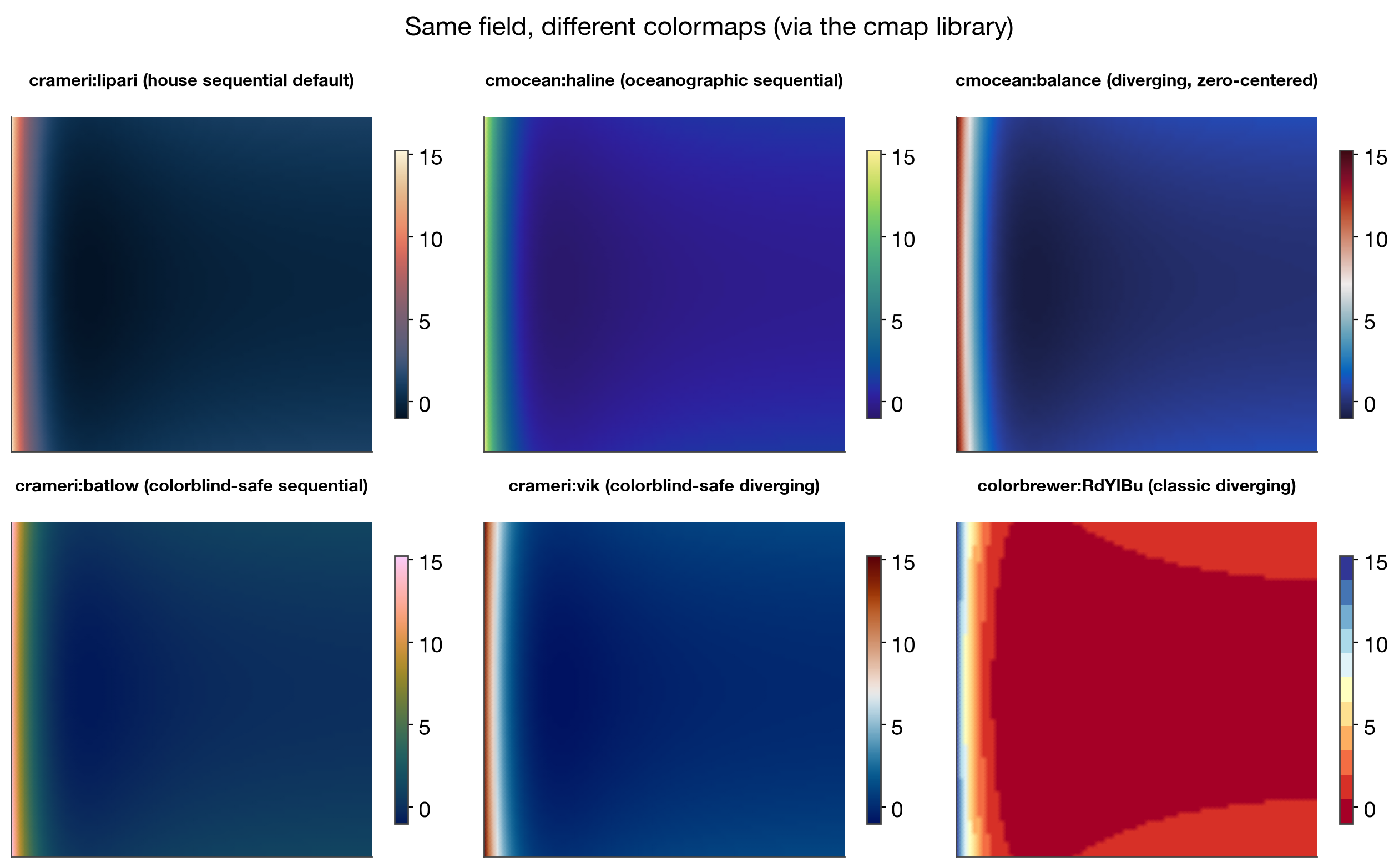
Colormaps (via the cmap library)
The same 2D field under six colormaps — the house sequential default
(default_cmap("sequential"), currently crameri:lipari) alongside picks
from cmap (pip/uv package, added to
the plotting extra in pyproject.toml), which bundles cmocean, Fabio
Crameri's scientific colormaps, ColorBrewer, and more — over 1500 registered
names. Not viridis: matplotlib's own default reads fine on its own but
isn't part of the house system, so a figure using it looks inconsistent next
to everything else built through default_cmap()/MULTI_CMAP_SHORTLIST.
crameri:batlow/crameri:vik and cmocean:haline/cmocean:balance are
specifically designed to be perceptually uniform and colorblind-safe;
colorbrewer:RdYlBu renders as visibly discrete bands here because
ColorBrewer's diverging maps are categorical by design, not a bug — a good
illustration of continuous vs. binned color encoding being genuinely
different choices, not just taste.
import cmap
cmap.Colormap("cmocean:haline").to_mpl()  # -> a normal matplotlib Colormap
2D histogram
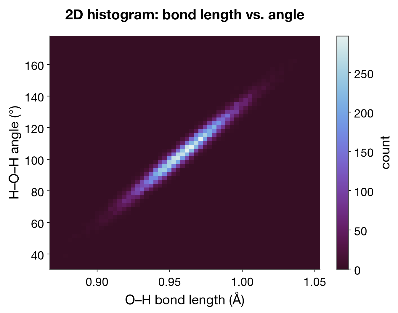
Binned density instead of an overlapping scatter of 20,000 points — past a few hundred points a scatter is just a saturated blob; the histogram is the honest representation of where the mass actually is.
Histogram time series ("kymograph")
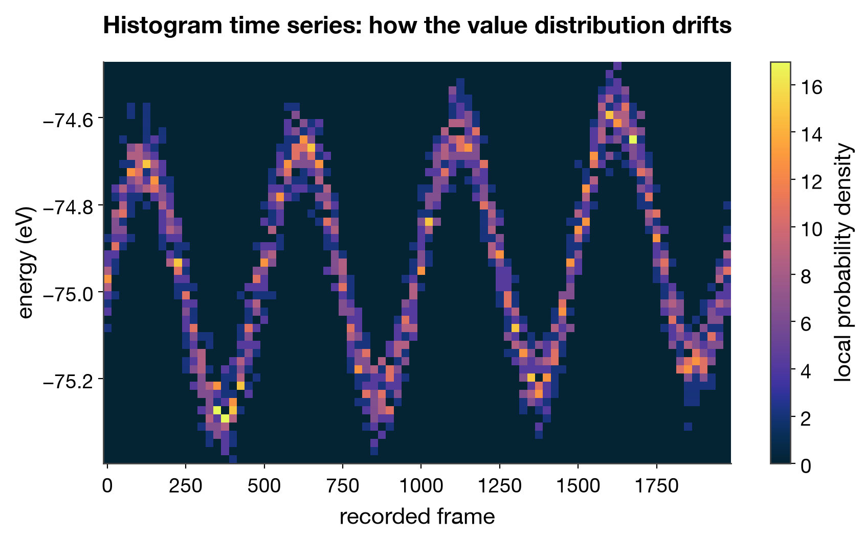
Small multiples taken to their limit: instead of N separate histograms (one per time window) shown side by side, each becomes one column of a single image (x = time, y = value bin, color = local density). A drift in the distribution — not just the mean — becomes one continuous shape instead of something you'd have to notice by comparing many separate panels.
Jitter / strip plot
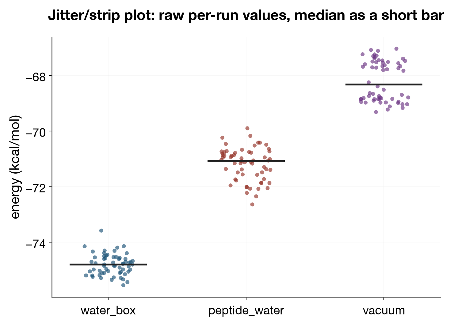
Every individual observation as one point, x position randomly jittered within its category so overlapping points stay visible instead of stacking into a solid blob. Data-ink principle: nothing here is a derived summary statistic drawn on top of the data — only a short median bar per group — so shape that a mean+errorbar would hide (skew, a bimodal group) stays visible.
Violin plot
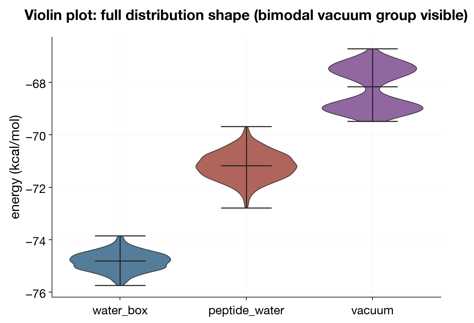
The same three groups, but the estimated full distribution shape instead of
individual points — complementary to jitter/strip: better once N is large
enough that individual points would overplot. The bimodal vacuum group,
invisible in a bar+errorbar chart, reads immediately as a violin with two
lobes.
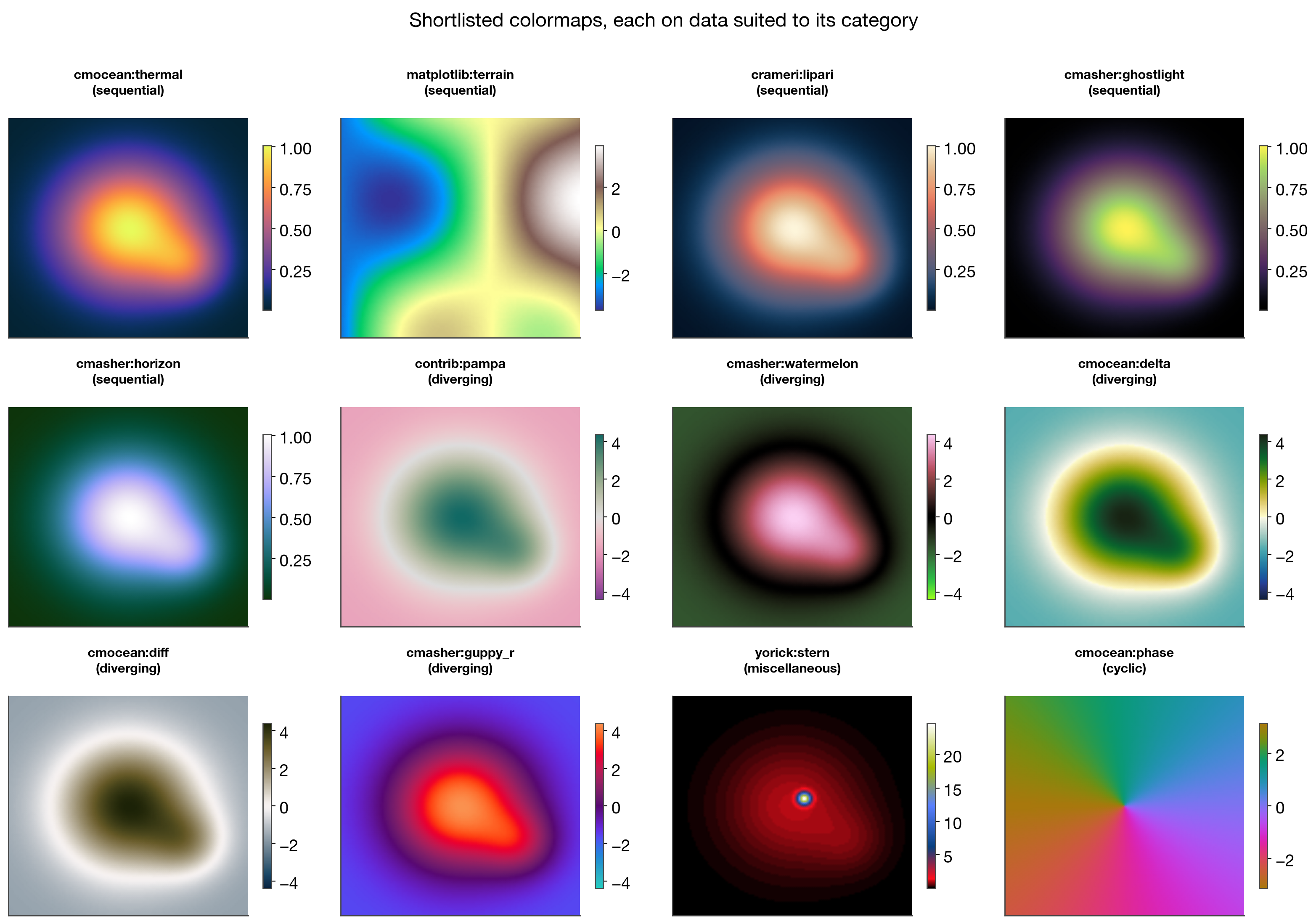
Colormap picks: choosing defaults
A shortlist of cmap-library colormaps, each rendered on synthetic data
suited to its own category (category read from cmap.Colormap(name).category,
not guessed) — regenerate with python scripts/render_colormap_picks.py.
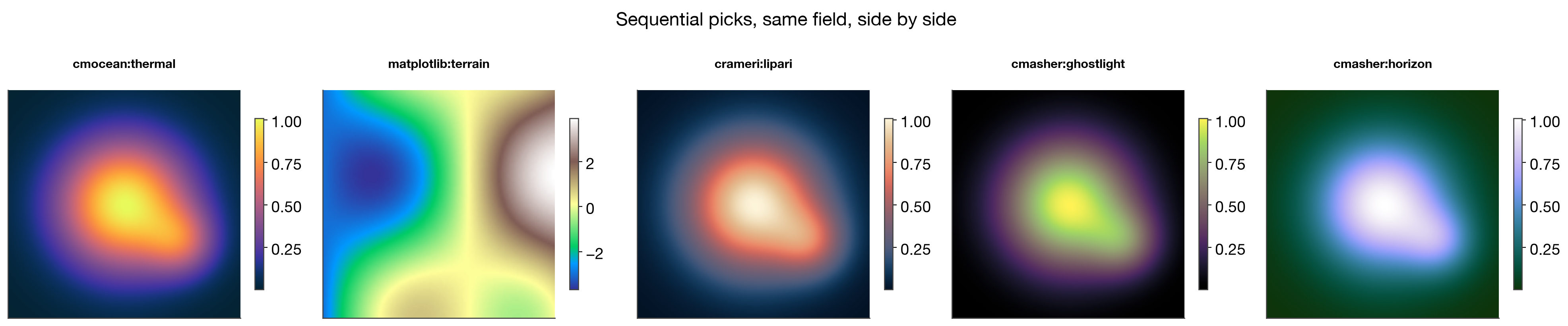
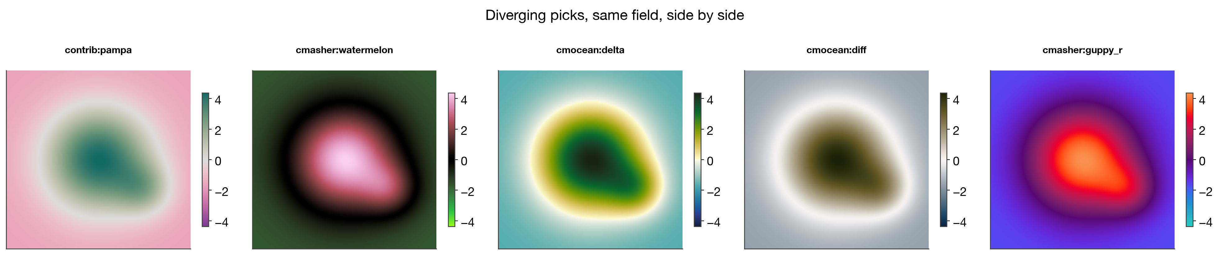
The goal is to pick one default sequential, one default diverging,
and one default cyclic map for the house style, the same way "icml"
became the default font/axis preset.
Sequential candidates, same field, side by side — smooth density-like data (strictly positive, no natural zero):
Diverging candidates, same zero-centered residual field, side by side:
cmocean:phase (cyclic) is shown separately in the overview above, on a
wrapped phase/angle field — the natural fit for periodic quantities like the
dihedral-angle radial histogram earlier in this gallery.
| Candidate | Category | Best suited to |
|---|---|---|
cmocean:thermal |
sequential | General-purpose warm sequential; reads well at a glance |
matplotlib:terrain |
sequential | Data with a literal "sea level" / physical elevation meaning — misleading otherwise (its blue-green-brown bands imply water/land, not just low/high) |
crameri:lipari |
sequential | Perceptually-uniform, colorblind-safe — the safest general default |
cmasher:ghostlight |
sequential | High contrast on a black background — good for a dark-mode variant, less so alongside white-background figures |
cmasher:horizon |
sequential | Similar dark-background contrast profile to ghostlight |
contrib:pampa |
diverging | Muted, low-saturation — won't fight with data ink, good default candidate |
cmasher:watermelon |
diverging | High-saturation pink/green — strong visual pop, worse for colorblind readers than the perceptually-uniform options |
cmocean:delta |
diverging | Built for velocity/flux fields; teal/gold poles read clearly |
cmocean:diff |
diverging | Muted olive/gray — closest in spirit to a "quiet," Tufte-style diverging map |
cmasher:guppy_r |
diverging | Vivid blue/orange — good contrast, less perceptually uniform than crameri:vik |
yorick:stern |
misc (HDR) | Only for genuinely high-dynamic-range data (one sharp feature over a broad faint background) — not a general sequential substitute |
cmocean:phase |
cyclic | The house default for any periodic quantity (angles, phases) |
Decided. House defaults, wired into
mmml.utils.plotting.styles.default_cmap(kind):
- Sequential:
crameri:lipari - Diverging:
contrib:pampa - Cyclic:
cmocean:phase
from mmml.utils.plotting.styles import default_cmap

ax.pcolormesh(xx, yy, zz, cmap=default_cmap("sequential"))
default_cmap raises a clear ImportError (not a silent fallback to an
unrelated matplotlib colormap) if the optional cmap library isn't
installed — uv sync --extra plotting or pip install cmap.
Merging notebook examples with the house style
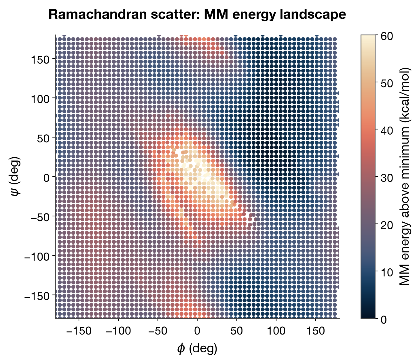
A working notebook (phi/psi Ramachandran energy-landscape exploration) had
several genuinely nice plot ideas — reworked here under the house style
("icml", legend_outside, big fonts) and default_cmap, using the real
64×64 phi/psi scan (artifacts/trialanine_phi_psi_mm_then_ml_64x64/phi_psi_pes.csv)
rather than synthetic data. Regenerate with
python scripts/render_ramachandran_gallery.py.
This is also the concrete version of "choosing a colormap category from the data" from the section above — each plot below picks sequential vs. diverging by asking what the data is, not by taste:
Ramachandran scatter (sequential: energy is strictly positive)
MM energy relative to its own minimum has no natural zero to diverge around
— default_cmap("sequential").
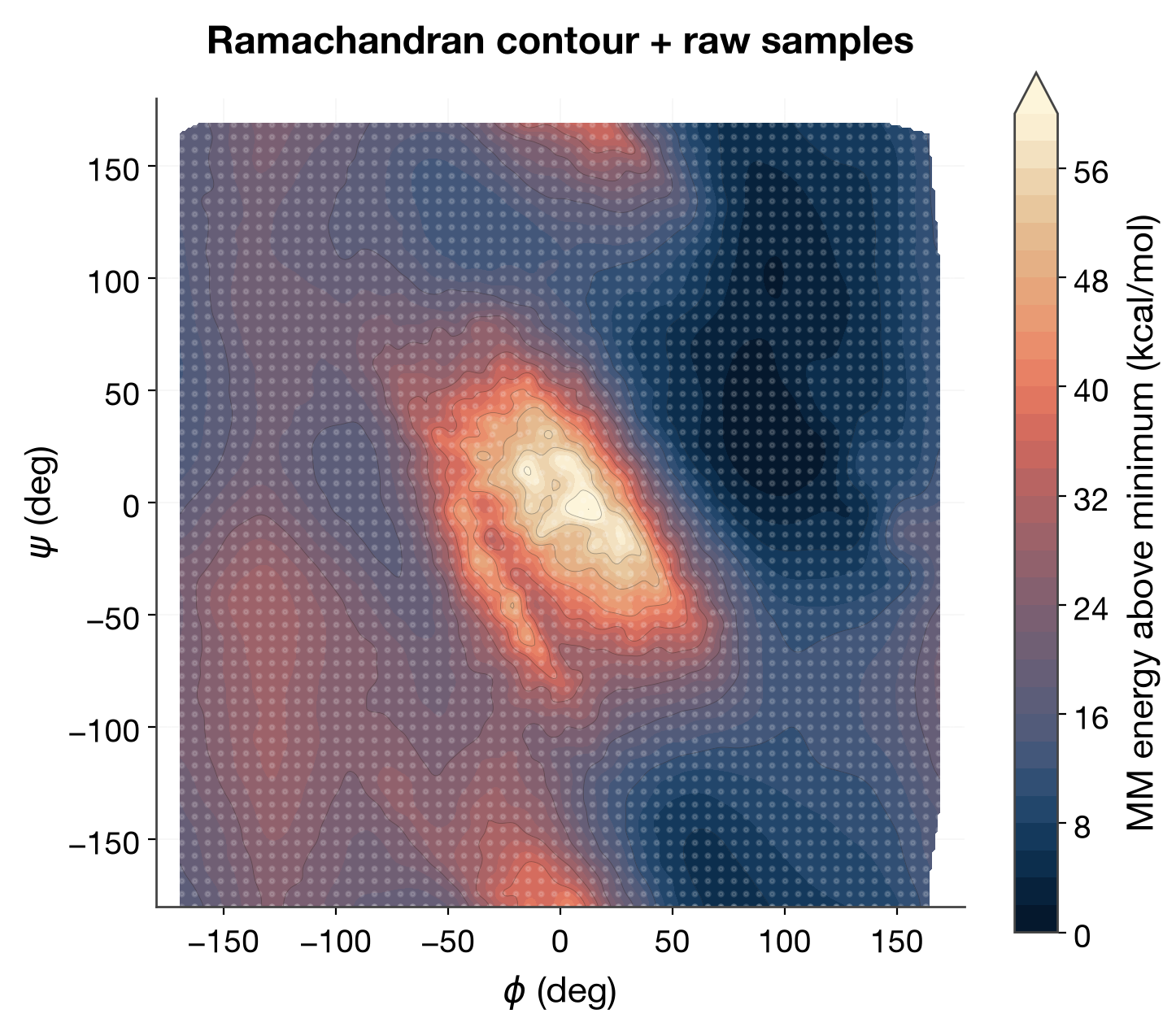
Ramachandran contour + raw samples (sequential)
The same data as a smoothed filled contour with the actual sample points overlaid faintly on top — reads both the interpolated landscape and exactly where it was (and wasn't) sampled.
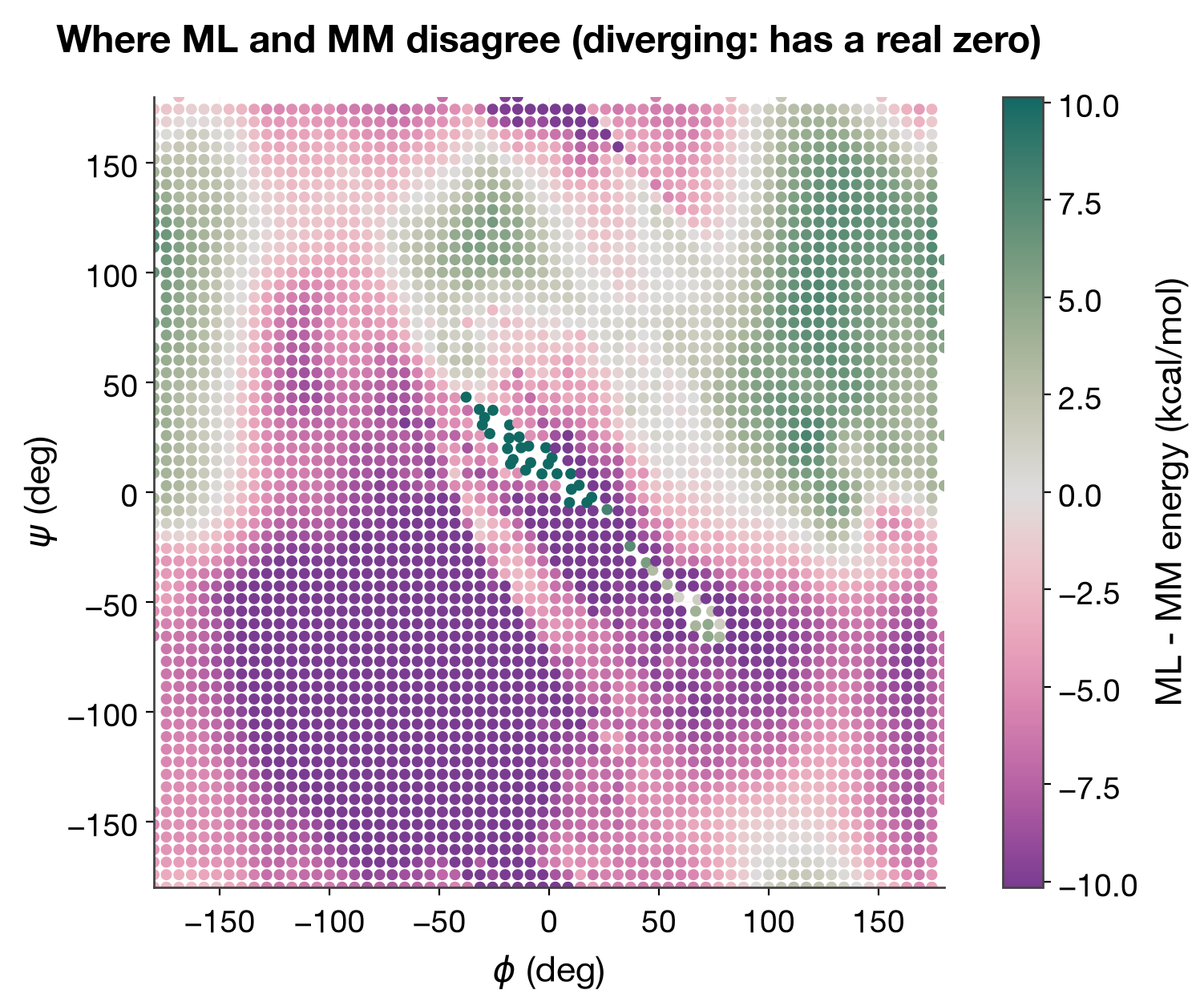
MM vs. ML disagreement (diverging: has a real zero)
ML energy - MM energy is a genuine residual — zero means perfect
agreement, positive/negative means ML over/under-estimates relative to MM.
This is diverging data, unlike the two panels above — default_cmap("diverging").
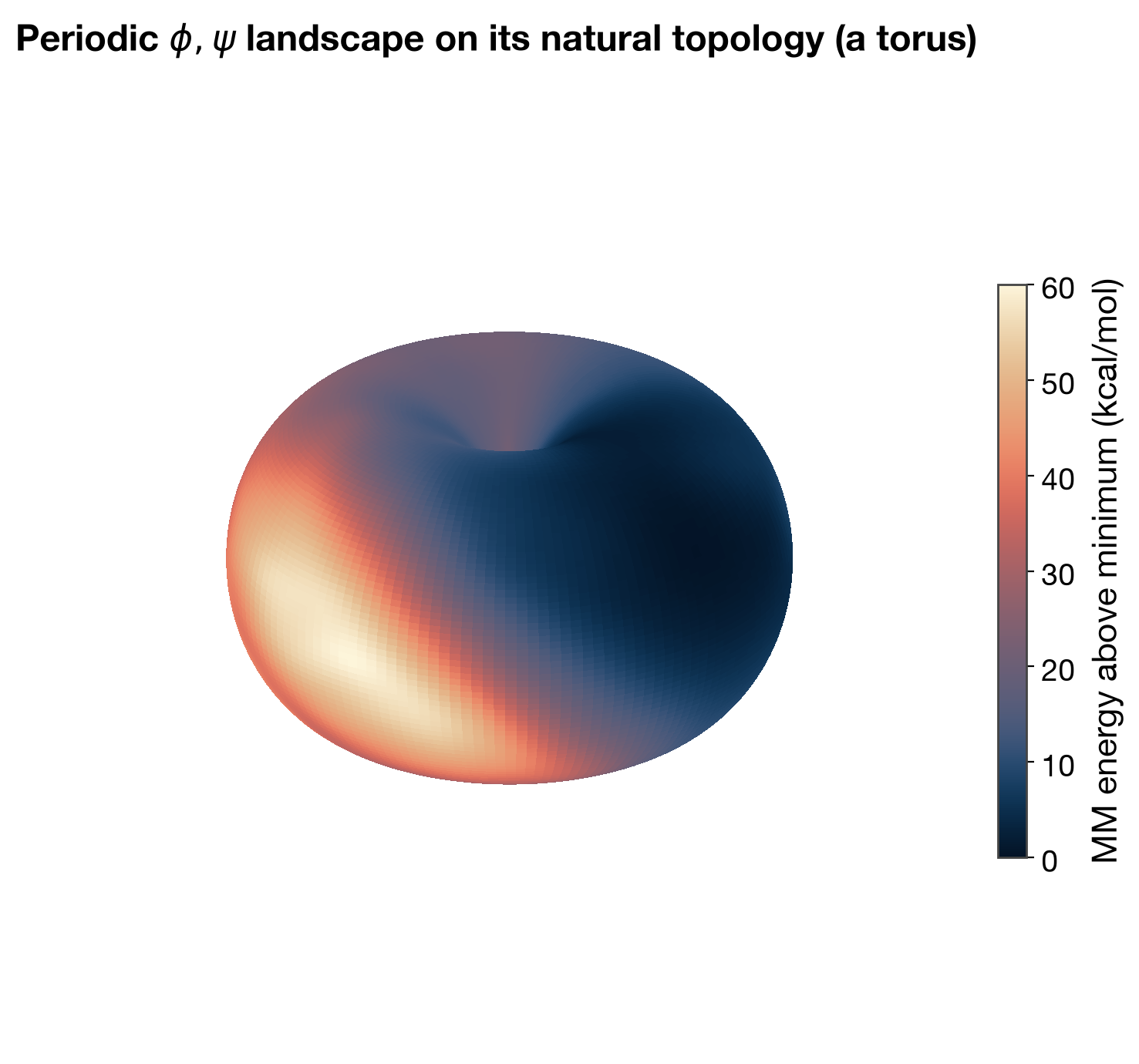
Periodic landscape on a torus (sequential, correct topology)
Phi and psi are periodic — φ=−180° and φ=+180° are the same geometry, not
adjacent-but-distinct values. A flat Ramachandran plot hides this at its
edges; wrapping the same data onto an actual torus removes the artificial
seam entirely. Energy is still the encoded quantity (not an angle), so this
stays sequential, not cyclic — cmocean:phase (cyclic) would be for coloring
by angle itself, e.g. the radial dihedral histogram earlier in this
gallery.
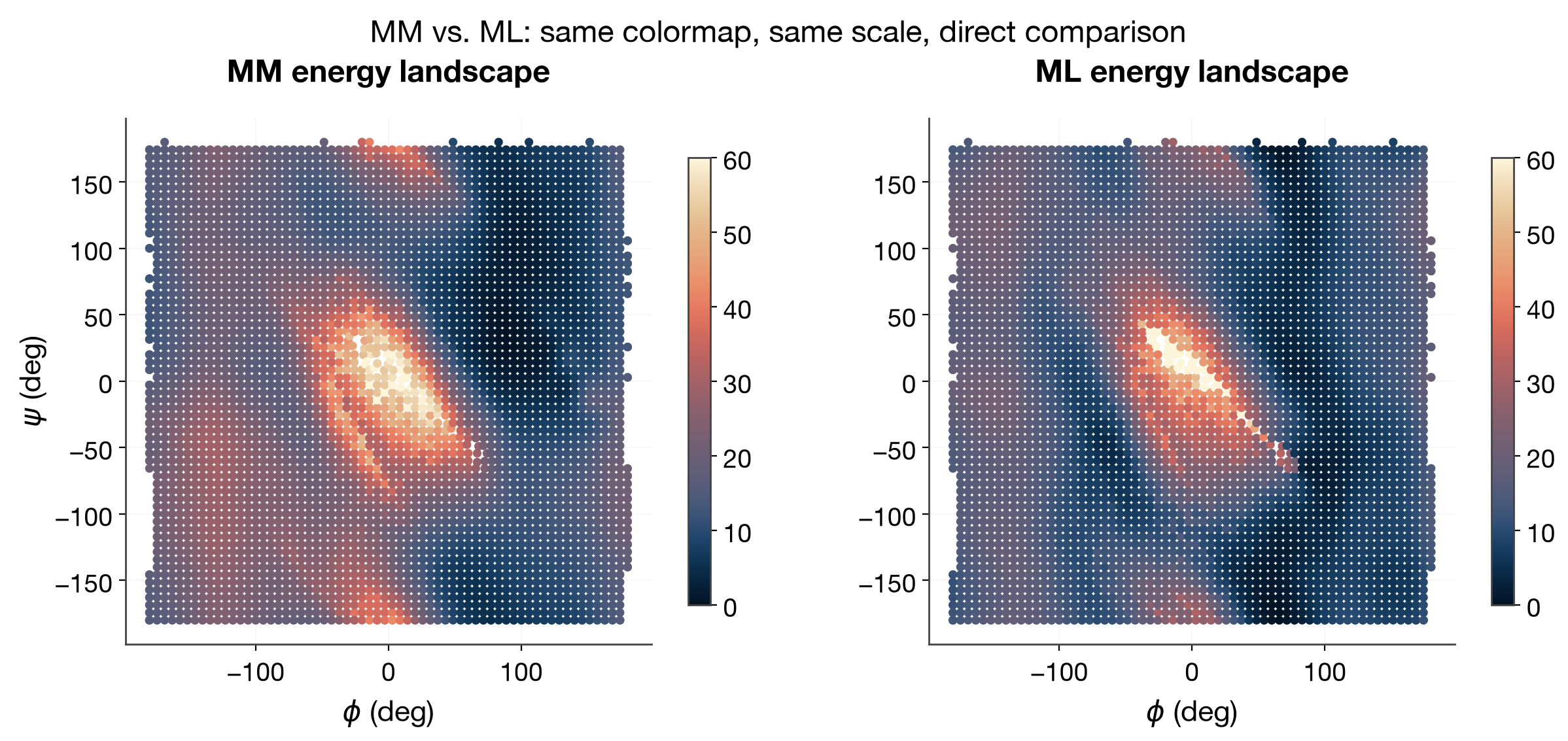
MM vs. ML, small multiples
The two landscapes side by side on the same colormap and the same color scale — direct visual comparison, the same principle as the font/chart-type small-multiples above applied to a real MM-vs-ML question.
Multipole visualization: a standardized complex figure
Multipole coefficients (charge, dipole, quadrupole, octupole — spherical
harmonics indexed by degree l and order m) as one colored, numbered box
per (l, m), in a Pascal's-triangle layout (row l has 2l+1 boxes,
centered) — regenerate with python scripts/render_multipole_gallery.py.
No real saved multipole-coefficient array exists in this checkout (real
values come from mmml.models.multipoles at runtime); these use
physically-plausible synthetic values matching that module's documented
units and packed-irrep convention (see the script's docstring).
Multipole triangle: colormap candidates
Multipole coefficients are signed — diverging data — but the house general
diverging default (contrib:pampa) is muted pink/teal, not the classic
red-positive/blue-negative convention that reads fastest for this
particular, very common plot. A dedicated red/blue shortlist:
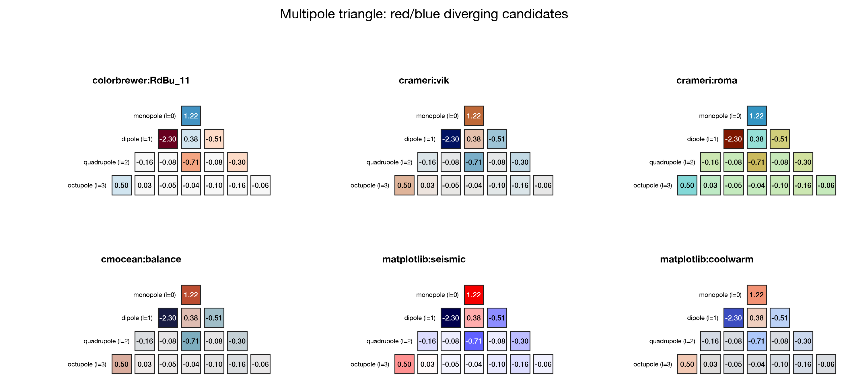
crameri:roma (top right) turned out not to actually be red/blue despite
being on the original shortlist — more brown/teal — a good reminder to
look at the render, not just the name, before picking.
Decided default: crameri:vik — the classic red-positive/blue-negative
read with a controlled, perceptually-uniform ramp (unlike matplotlib's
built-in seismic/coolwarm, which are not perceptually uniform). This is
complex_figure()'s default cmap_name in
scripts/render_multipole_gallery.py.
Each box in the triangle is now drawn with a visible inset gap
(plot_multipole_triangle(..., gap=0.08)) rather than edge-to-edge — plain
adjacent boxes with only a thin border read as one solid mosaic; the gap
lets each (l, m) value read as its own cell.
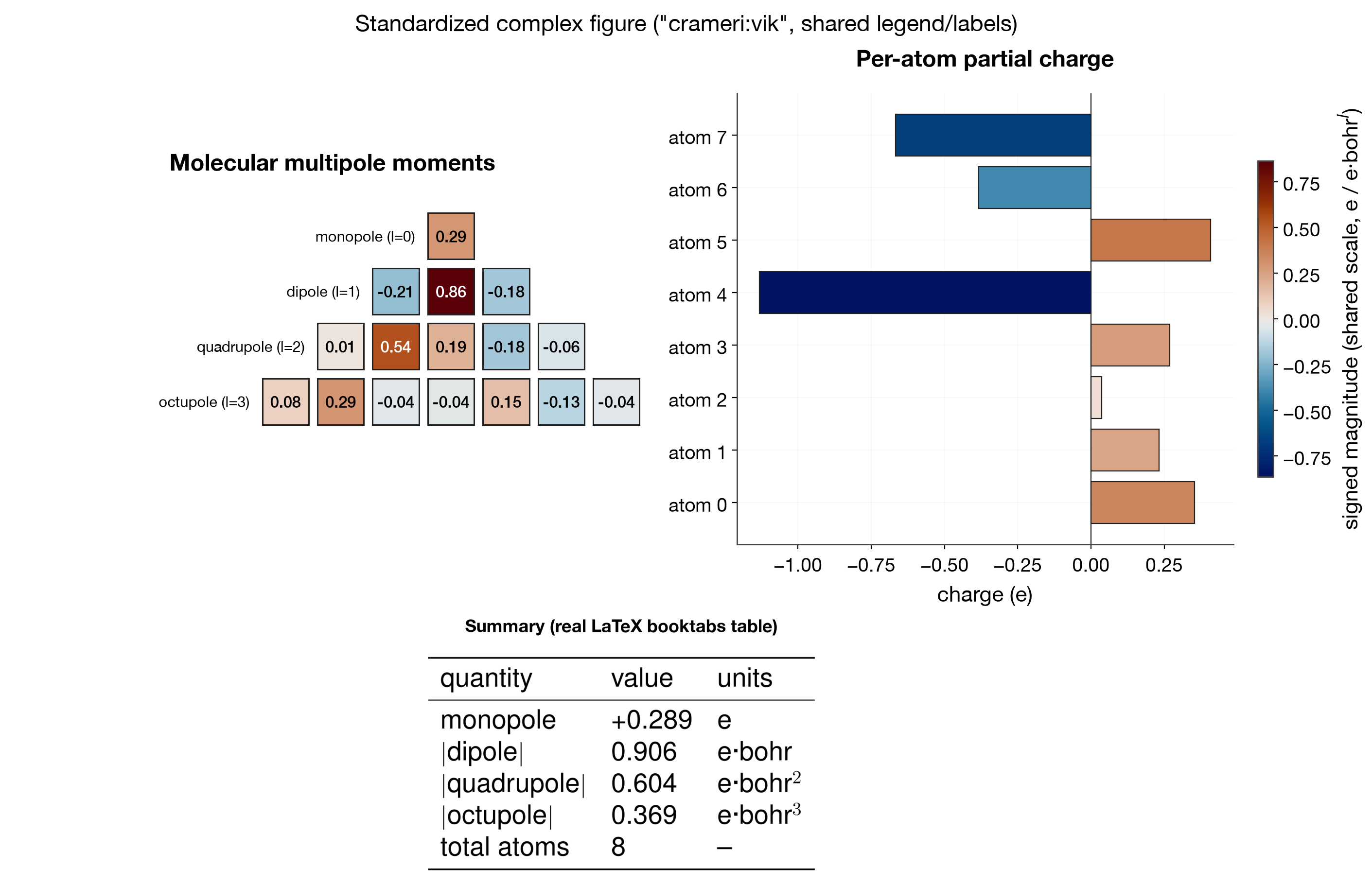
Standardized complex figure
Multipole triangle + per-atom partial-charge bars + a real LaTeX-typeset
booktabs summary table, combined under the "Complex figure layout" rules
from docs/plotting-style-guide.md: one
shared colorbar for both the triangle and the bars (same colormap, same
scale, constrained_layout=True so it doesn't overlap either panel), and
latex_table_image() for the summary — compiled with pdflatex and
rasterized at 400 DPI, so it has real kerning and decimal-point alignment
instead of matplotlib's Axes.table approximation:
from mmml.utils.plotting.styles import latex_table_image, latex_available, shared_axis_labels

if latex_available():
    latex_table_image(ax_table, cell_text, col_labels=col_labels)
else:
    booktabs_table(ax_table, cell_text, col_labels=col_labels)  # matplotlib fallback
See docs/plotting-style-guide.md "Tables:
LaTeX-typeset booktabs" for why, and when to fall back to
booktabs_table().
Fields as parametric surfaces
Where the multipole triangle above shows the coefficients as an abstract
(l, m) mosaic, these show the field those coefficients produce in real
space — the same parametric-surface idea as the torus, but the natural surface
here is a sphere around each source. Regenerate with
python scripts/render_multipole_field_gallery.py
(mmml.utils.plotting.multipoles).
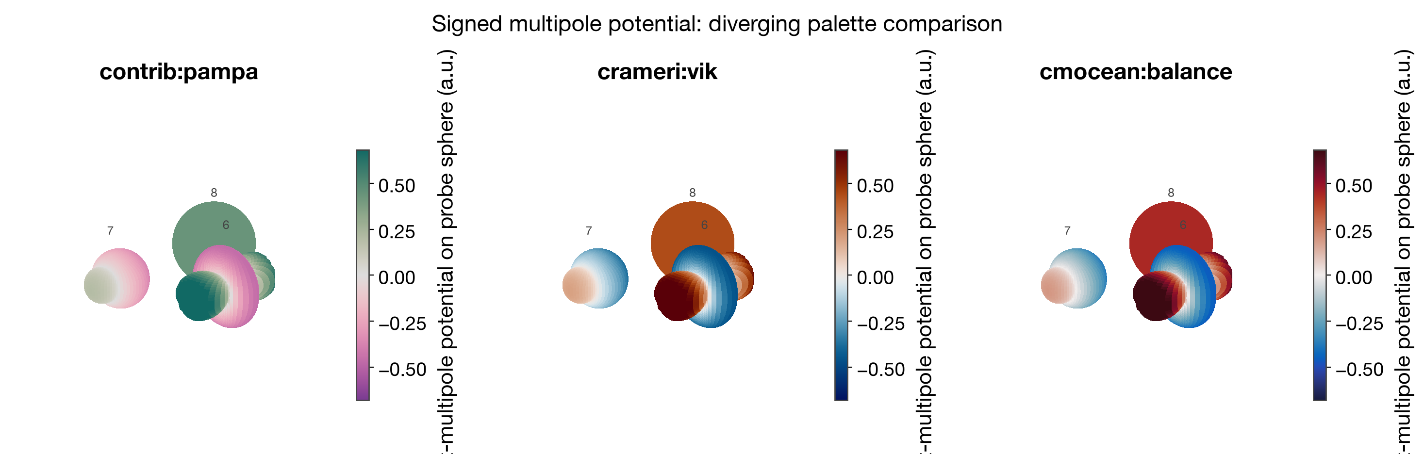
Multipole surfaces: one deformed sphere per source
Each source's angular electrostatic potential is sampled on a probe sphere and
wrapped back onto it — radius bulges with |V|, colour is the signed potential.
A bare charge is a round, one-colour sphere; a dipole shows the familiar +/-
lobes; a quadrupole is four-lobed. The potential is signed, so colour is
diverging about zero (default_cmap("diverging")), the same rule as the
Ramachandran difference plot.
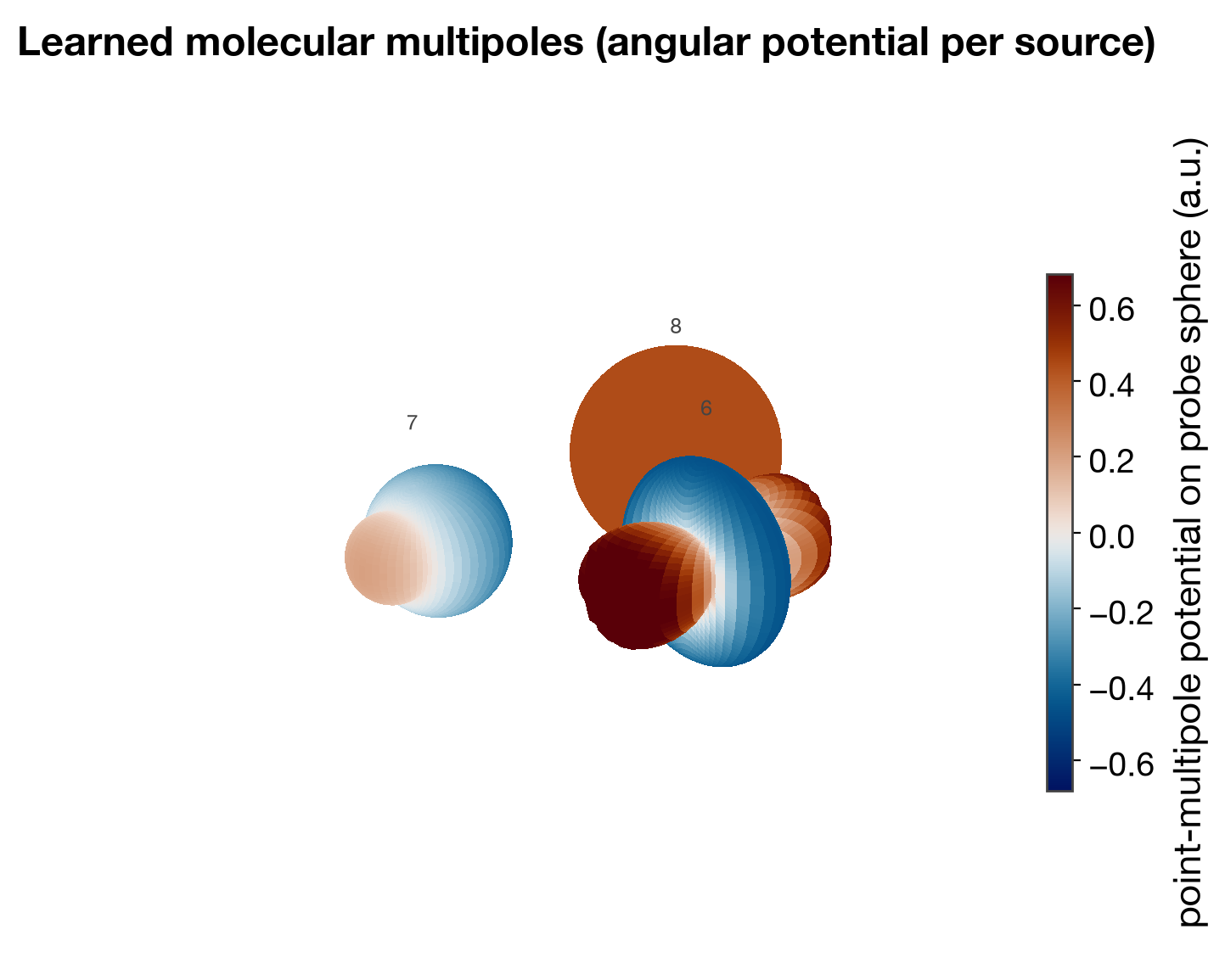
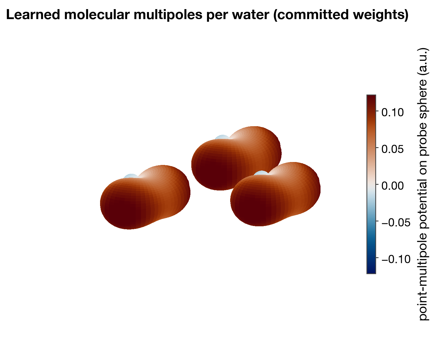
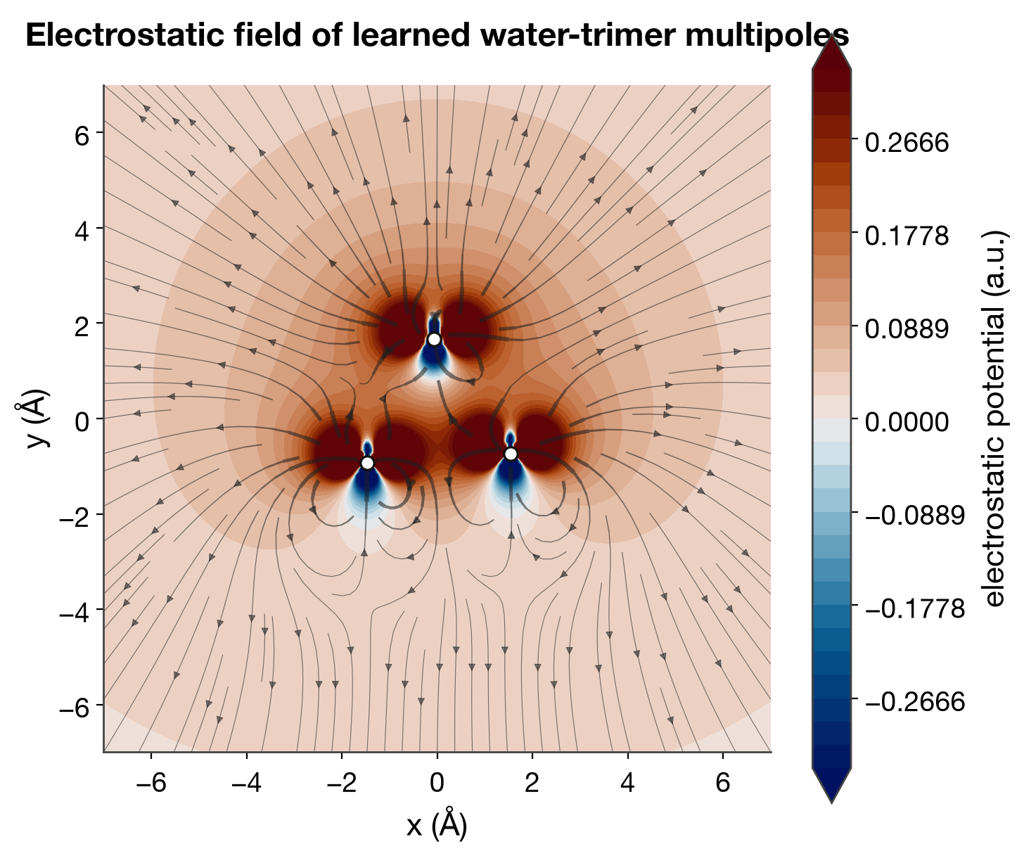
The scene above is analytic (one clean monopole, dipole, quadrupole) so the lobe
structure is unambiguous. The same function drives real predictions: the learned
multipole model emits one molecular multipole per fragment, so pointing it at a
water trimer (via the committed multipoles_20260711-100037_epoch-0100.json
weights) gives one sphere per water. The learned waters carry a small net charge,
so the monopole dominates the surface with only weak dipolar structure on top —
an honest picture of what this checkpoint predicts, not the idealized lobes:
Colour is a real choice for signed data, not a default to accept. Every plotter
takes a cmap= override — a house kind ("diverging"), a cmap-library name
("crameri:vik", "cmocean:balance"), a matplotlib name, or a Colormap object.
The muted house default beside the two classic red/blue reads:
The field itself: potential contours + streamlines
When you want the field of the whole set rather than per-source lobes,
plot_field_slice lays a grid on a plane through the sources and draws filled
potential contours (diverging, real zero) under electric-field streamlines. It
wraps the existing physics in
mmml.models.multipoles.electrostatics._point_multipole_potential_field_au;
nothing new is computed, only drawn.
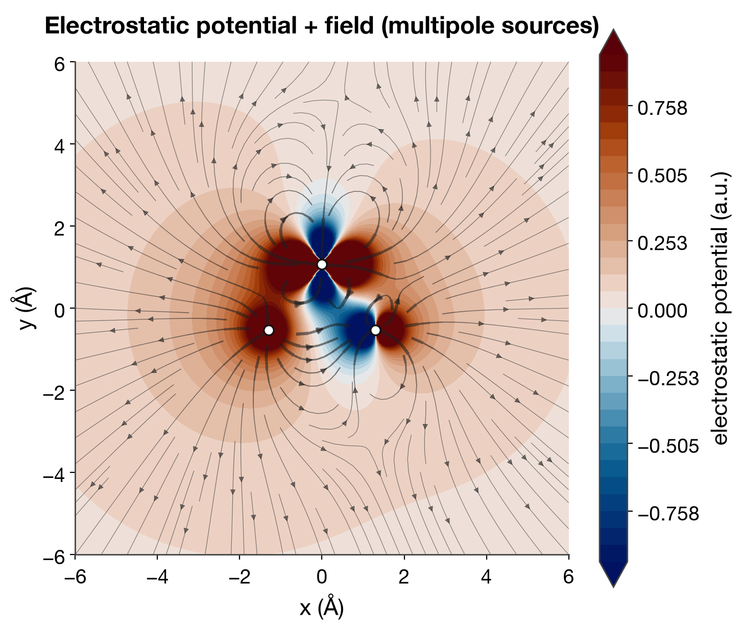
Driven by the committed weights on the same water trimer, this is the field the learned model actually produces:
Going up the expansion, rank by rank
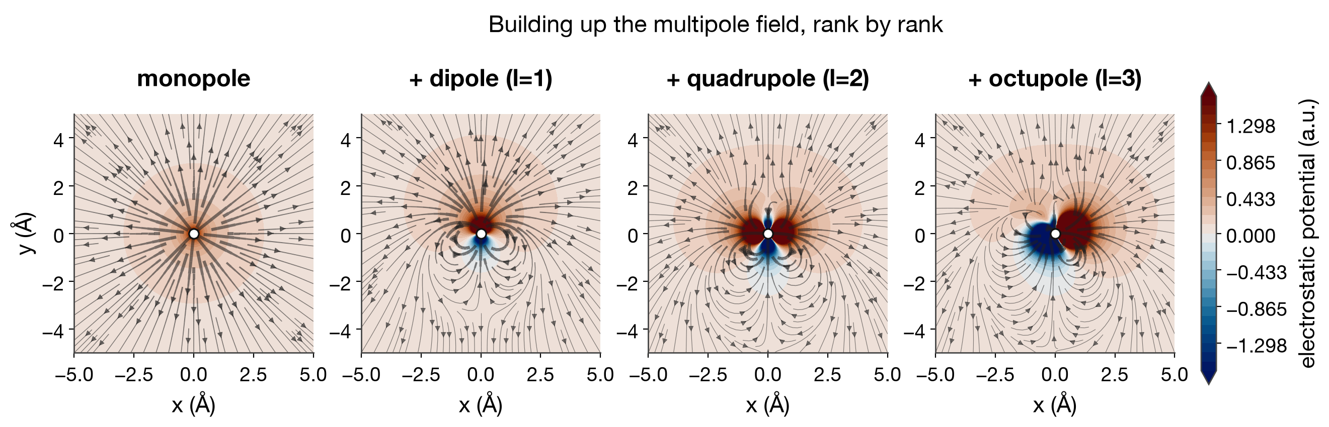
The multipole expansion is a series, and plot_field_progression shows it as
one: a single site's field with the monopole alone, then adding the dipole
(l=1), quadrupole (l=2), and octupole (l=3), all on a shared colour scale so the
angular structure each rank contributes is directly comparable. The monopole is
radial; the dipole breaks the up/down symmetry; the quadrupole adds four lobes;
the octupole sharpens the near-field angular detail. Electrostatics defaults to
crameri:vik (the classic red-positive/blue-negative read).
Extending the language to the MBD term
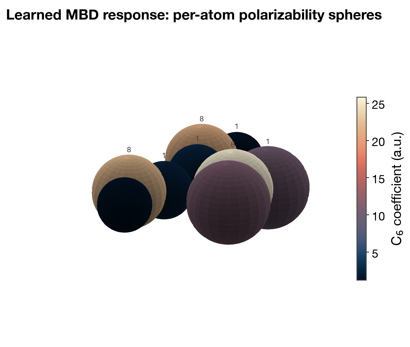
The learned MBD dispersion model predicts a per-atom polarizability and C6
coefficient — both strictly positive, so sequential colour, not diverging.
plot_mbd_surfaces draws one sphere per atom (radius ~ α^(1/3), the
polarizability volume; colour = C6), the dispersion analogue of the multipole
surfaces. Rendered here from the real trained checkpoint on a water cluster:
oxygens come out large and high-C6, hydrogens small and low.
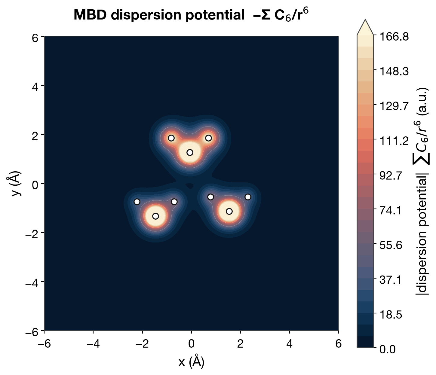
And the -Σ C6/r^6 dispersion potential on a plane, the sequential counterpart
to the electrostatic field slice above:
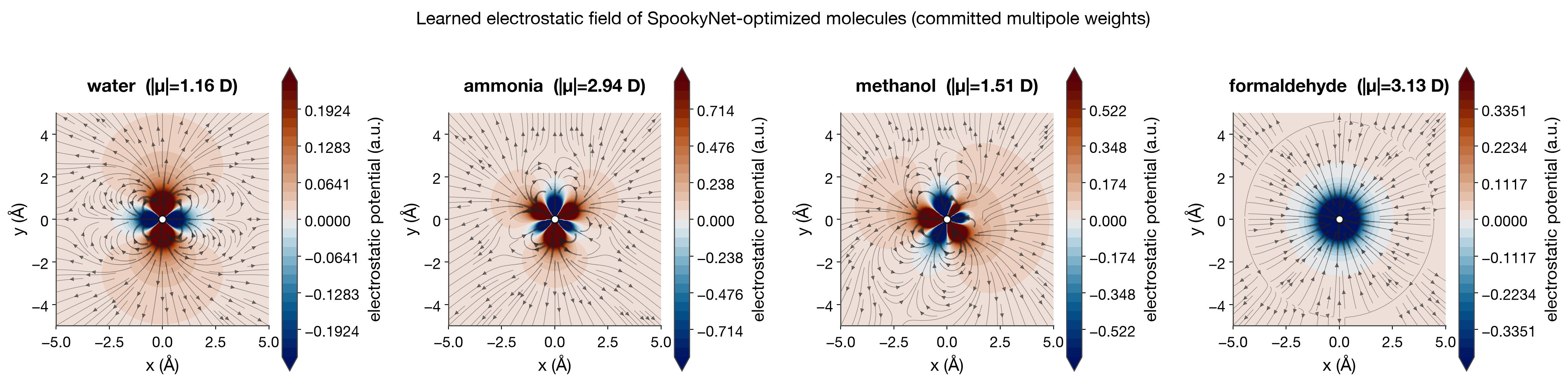
Real molecules: optimized, then predicted
The scenes above are analytic, to make the method legible. This row is the real
pipeline end to end (scripts/render_multipole_real_molecules.py): four small
molecules geometry-optimized on the trained SpookyNet potential, then their
learned molecular multipoles predicted on the optimized geometry with the
committed multipole weights. The field each molecule produces, side by side —
water, ammonia, methanol, formaldehyde:
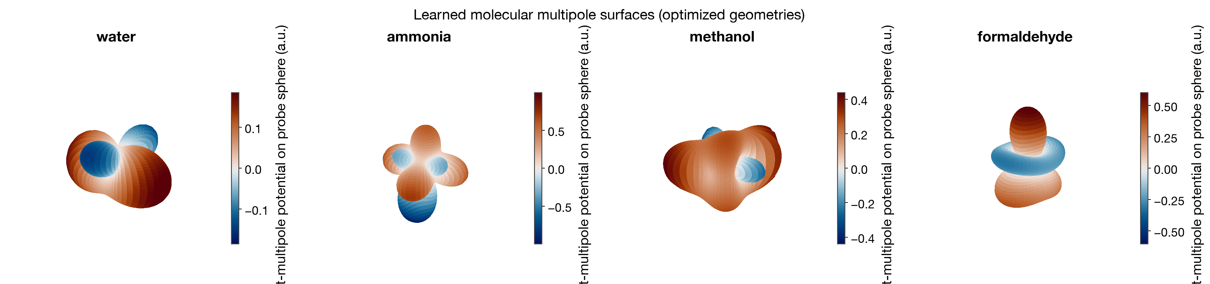
The same molecules as multipole surfaces (probe radius pulled in to 1.4 Å so the dipole/quadrupole/octupole angular structure reads over the monopole):
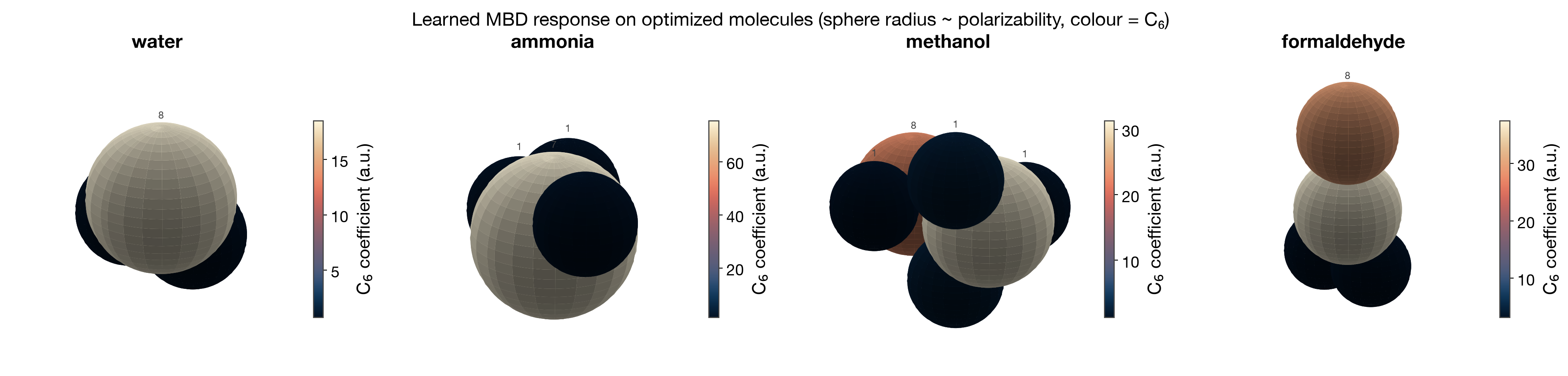
And the learned MBD response on the same optimized geometries — heavy atoms carry the large polarizability and C6, hydrogens are small:
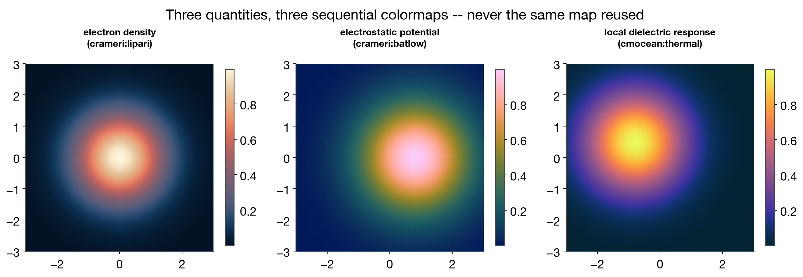
Colormaps for a figure with several panels
A figure with more than one sequential (or diverging) panel — one per
physical quantity — should not reuse a single colormap for all of them; that
erases the fact that the panels encode different things. Pick a distinct map
per panel, in a fixed order, from MULTI_CMAP_SHORTLIST:
from mmml.utils.plotting.styles import MULTI_CMAP_SHORTLIST

names = MULTI_CMAP_SHORTLIST["sequential"][:3]  # or ["diverging"] / ["cyclic"]
MULTI_CMAP_SHORTLIST[kind][0] is always the same as the corresponding
default_cmap(kind) — reserve it for the figure's "primary" quantity, and
use the later entries for secondary panels, so a repeated panel (e.g. "MM
energy" across many workflow figures) keeps the same colormap project-wide.
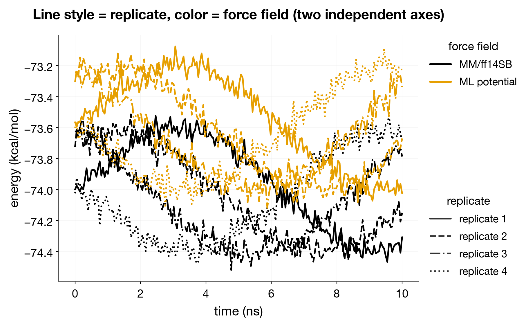
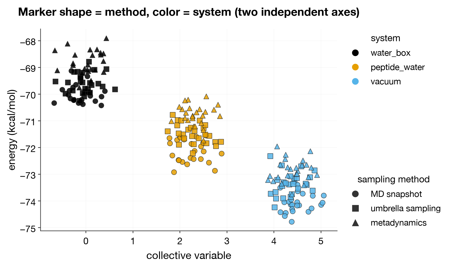
Line styles, markers, and symbols
Color is not the only axis available — line style (dash pattern) and marker
shape are a second, independent categorical encoding, useful when: a figure
already spends color on one distinction (e.g. force field) and needs a
second one (e.g. replicate) on top of it; the figure must survive grayscale
printing; or color-alone identity would fail a colorblind reader even with a
safe palette (redundant coding). See LINE_STYLE_CYCLE / MARKER_CYCLE in
mmml.utils.plotting.styles and
docs/plotting-style-guide.md "Line styles,
markers, and symbols" for the full writeup.
Line style = one axis, color = another
Marker shape = one axis, color = another
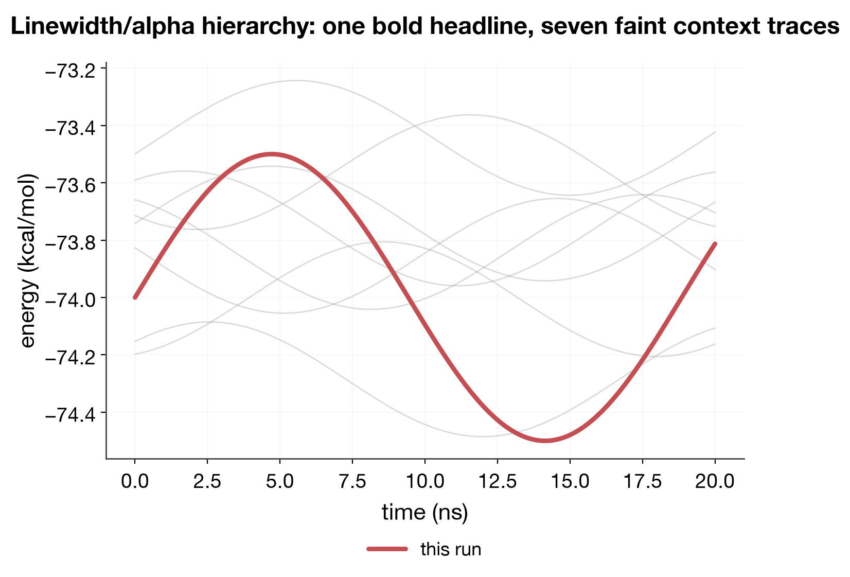
Linewidth/alpha as a visual hierarchy (not categorical at all)
A non-categorical use of the same idea: bold + opaque for the "headline" series, thin + faint for supporting context, so the eye finds the point without reading the legend first.
Finite-difference validation: analytic vs. numerical forces
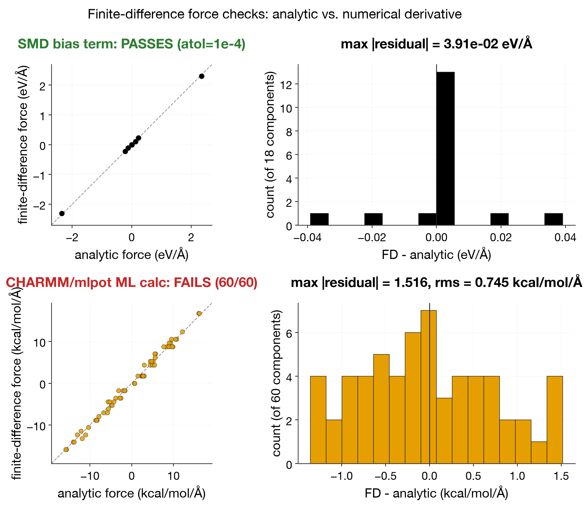
A finite-difference (FD) check compares an analytic force (autodiff, or a
hand-derived gradient) against a central-difference numerical derivative of
the energy — the standard way to catch a sign error, a missing term, or a
broken chain rule in a force implementation. Regenerate with
python scripts/render_fd_test_gallery.py. Two real checks, deliberately
shown side by side rather than cherry-picking the passing one:
- SMD bias restraint (
mmml.md.energy.terms.SMDBiasTerm, the same check astests/unit/test_md_energy_terms.py::test_ase_forces_match_finite_difference) — PASSES,atol=1e-4. - CHARMM/mlpot ML-only calculator
(
mmml/interfaces/pycharmmInterface/mlpot/derivative_test.py, saved result atartifacts/pycharmm_mlpot/mlpot_force_fd.json) — currently FAILS all 60 checked force components againsttol=0.005 kcal/mol/Å, with a max discrepancy of 1.52 kcal/mol/Å and rms 0.75. This is real, current state, not historical — worth fixing before trusting forces from that integration path.
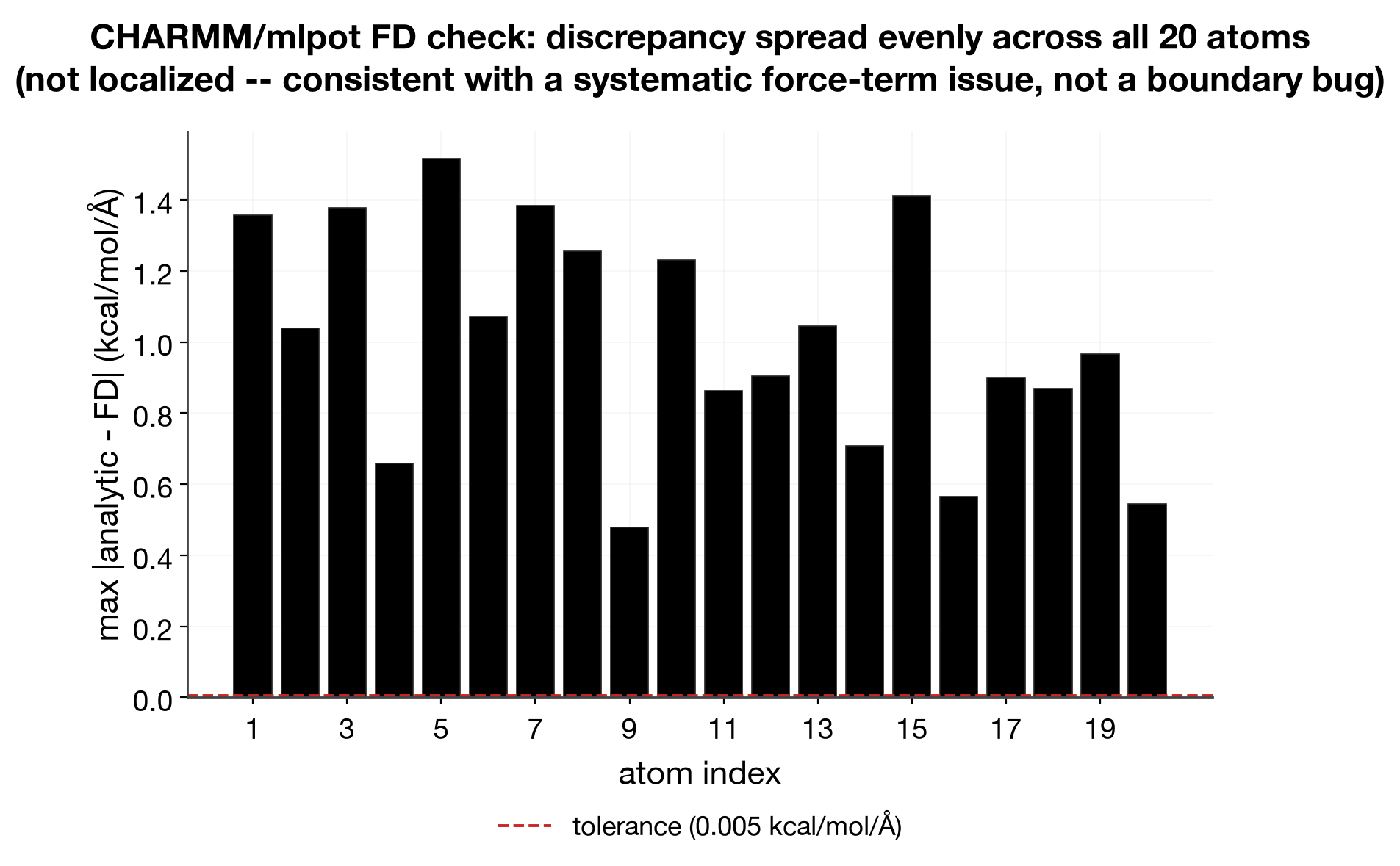
The per-atom breakdown of the failing check shows the discrepancy spread roughly evenly across all 20 atoms rather than concentrated on a few — that pattern is more consistent with a systematic force-term issue (a missing or mis-signed contribution present at every atom) than a boundary/indexing bug that would only hit a handful of atoms:
How to pick
from mmml.utils.plotting.styles import apply_plot_style

apply_plot_style("icml")  # or editorial_dejavu_serif / _dejavu_sans / _stix / _cm
_STYLE_NAME in workflows/*/scripts/plot_results.py and plot_structure.py
is currently "icml" — see docs/plotting-style-guide.md
for the rest of the convention (semantic color, DPI, uncertainty shading,
legends outside).
(There was a 5th candidate, editorial_stixsans, dropped from the gallery:
matplotlib has no real "STIX Sans" font bundled, so it silently fell back to
the same rendering as editorial_dejavu_sans — not a meaningfully distinct
option.)